Introduction: Why Proper Medal Artwork Matters
Quality artwork is the foundation of any successful custom medal or badge project. Clear medal artwork guidelines help manufacturers like Gairun turn your vision into precise, durable metal goods—on time and within budget. When artwork files meet technical standards for vector artwork for medals, the result is fewer revision rounds, faster production, and consistent branding. This guide covers essential file requirements, color matching best practices, and design tips to streamline the process from start to finish.
Medal Artwork Guidelines—The Gold Standard for File Preparation
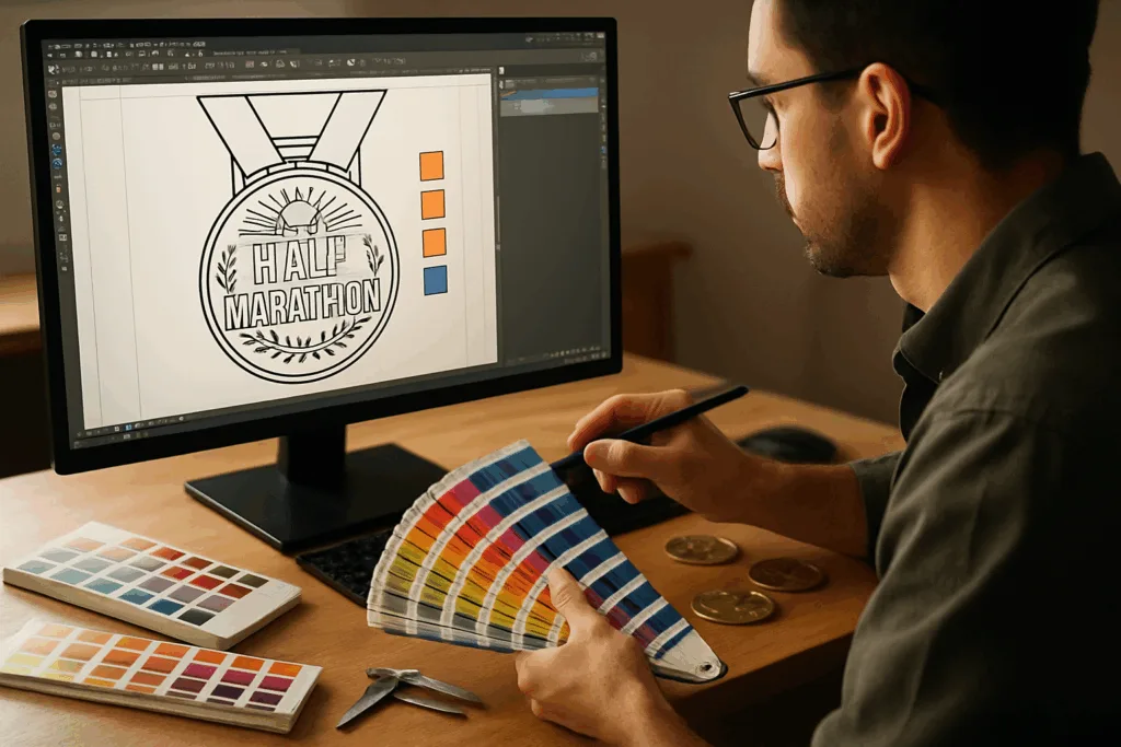
Preparing artwork for custom medals and badges requires a blend of creativity and technical know-how. The artwork you provide will guide die making, stamping, casting, or engraving. Manufacturers rely on precise files to ensure high-quality conversion from digital graphics to physical medals or badges. Below, we detail best practices for file format, vector standards, line thickness, fonts, and color referencing.
Essential File Formats for Medal Artwork
- Adobe Illustrator (AI): Industry-leading for vector medal artwork.
- CorelDRAW (CDR): Popular, especially in badge design workflows.
- Encapsulated PostScript (EPS): Universally accepted, ideal for cross-platform use.
- PDF (Portable Document Format): Preferred if saved in vector form and fonts are outlined.
Always send vector files for medal and badge projects. Raster formats (JPEG, PNG, TIFF) are suited only for reference or background images—not manufacturing. Vector artwork for medals allows scalable design, smooth lines, and perfect reproduction on metal. If unsure, ask your supplier to validate your files early.
Line Thickness and Detailing: Getting Metal to Match Your Vision
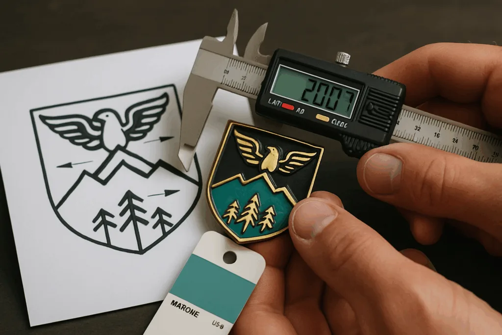
Minimum line thickness is critical: metal dies can’t reproduce lines thinner than the mold allowance. For die-cast medals and badges made by Gairun, the recommended minimum line width is 0.15 mm for raised elements, and 0.2 mm for recessed or etched sections. These tolerances ensure artwork translates correctly from screen to finished product. Overly thin lines may fill in, while oversized lines lose finer detail.
Best Practices for Medal Artwork Lines
- Avoid hairline strokes (less than 0.1mm), especially for small text or intricate logos.
- Uniform line weights enhance readability and resist metal flow during casting or stamping.
- Combine smooth curves and sharp edges for dynamic relief, but keep separation clear.
Fonts and Typography: Ensuring Legibility on Metal
The way fonts are handled in vector artwork for medals influences both aesthetics and manufacturability. Always convert fonts to outlines or curves before submitting. This locks your font choice and avoids substitution issues if the manufacturer does not have your font library. Avoid script or ultra-thin fonts for small-sized text areas, as these may blur or close up in metal. Aim for sans-serif or bold serif fonts above 3 mm cap height for best results.
Tips for Medal Fonts
- Minimum readable text size: 3 mm for most metal processes.
- Outline fonts in AI/CDR/EPS—no embedded fonts.
- Restrict use of decorative typefaces to prominent, large areas only.
Color References: Pantone Matching for Accurate Finish
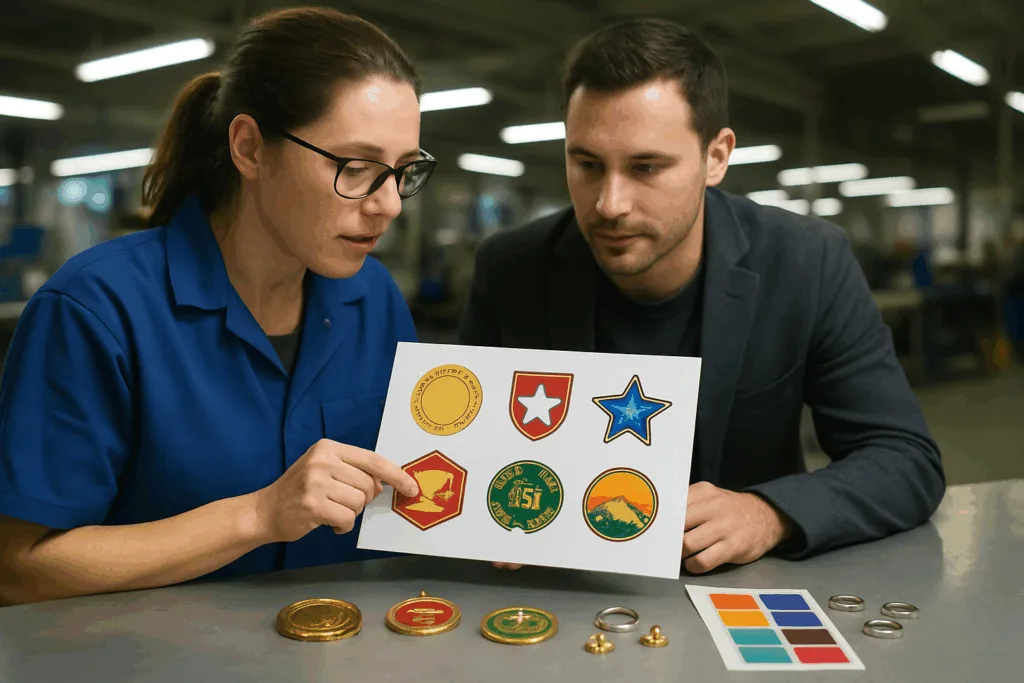
When artwork includes colored enamel, plated finishes, or painted details, specify Pantone colors (Pantone Solid Coated for spot colors). This universal system lets Gairun and other manufacturers match your brand shades with hard or soft enamel, paint fill, or epoxy dome. Avoid ambiguous terms like “dark blue” or “gold” in your files. Always provide Pantone codes (e.g., PMS 293C for blue) next to each color element. For medal platings (matte black, antique brass, nickel), reference standard finish swatches or request samples.
Artwork Layering & Separation
Organize artwork in clearly labeled layers for front, back, color areas, metal relief, cutouts, or custom inserts. This streamlines communication with the manufacturer and helps prevent costly misunderstandings regarding 2D/3D relief, fill depths, and assembly details. Group or color-code elements to indicate levels—e.g., raised, recessed, color-filled, cut-through.
Full Vector Artwork for Medals: Why It Matters
Vector files use nodes and paths instead of pixels, allowing infinite scaling and high-fidelity engraving, cutting, and etching. This results in crisp details regardless of medal size. Gairun utilizes vector artwork for medals in die making, CNC machining, laser engraving, and stamping. Non-vector (raster) files, like JPEG or PNG, cannot be efficiently converted for production and often cause delays or loss of detail.
Comparing Artwork File Types for Medals and Badges
| File Format | Editability | Quality Loss | Compatibility | Best Use |
|---|---|---|---|---|
| AI/CDR | Fully editable (vector) | None | Industry standard | Primary source for medals, badges |
| EPS | Editable (vector) | None | Broad | Cross-platform sharing |
| PDF (vector) | Editable if outlined | Minimal | Universal | Final approval, proofs |
| JPEG/PNG | Not editable | Visible pixelation | Limited | Reference only |
Good Artwork = Fewer Revisions, Faster Lead Times
Every manufacturer values clear, error-free artwork. Good medal artwork guidelines ensure that feedback cycles are minimal—often skipping lengthy proof revisions. Gairun can go straight into tooling, plating, and assembly with files meeting vector artwork and file requirements. This tightens production schedules, minimizes misunderstanding, and lowers overhead, letting you launch your event, brand, or promotion on time.
File Requirements for Medals and Badges
Here’s a detailed checklist to make your artwork production-ready for custom medal and badge manufacturing:
- Save in vector format: AI, EPS, CDR, or vector PDF only.
- Outline all fonts; avoid embedded text.
- Set minimum lines: 0.15 mm raised, 0.2 mm recessed.
- Define Pantone colors for each enamel or fill area.
- Label layers for front, back, metal, enamel, cutouts, and accessories.
- Include clear dimensions (mm), bleed areas, and material callouts.
- Provide any custom mounting details—e.g., butterfly clutch placement, split ring hole size, lanyard loop.
Designing for 2D vs. 3D Relief in Medal Artwork
Medals and badges can feature 2D or 3D relief. 2D relief uses flat layers and defined borders—ideal for logos, simple icons, or text badges. 3D relief showcases sculpted features with rounded edges and varying heights for a lifelike look. Clearly show relief type in your artwork and mark zones for hard or soft enamel, sandblasted backgrounds, or mirror-finished highlights. Include cross-sections for complex badges that require depth indication.
Relief Depth and Fill Control
For medals with enamel or paint fill, specify recess depths (0.3–1.2 mm is typical for hard/soft enamel). Mark fill areas clearly and use closed shapes in vector paths. This prevents color bleed and ensures sharp edges. Gairun controls fill depth to avoid spillage and maintain accurate Pantone color retention over time.
Pantone Color Referencing—A Must for Medal Artwork
Accurate color matching is vital for marketing, branding, and event recognition. Always use Pantone Solid Coated numbers in your artwork files. Manufacturers rely on Pantone swatch books for comparison during enamel mixing, paint finishing, and plating. Gairun offers swatch-sample service for critical brand colors upon request. For non-enamel finishes (antique brass, gunmetal, rose gold), reference the supplier’s standard sample chart or arrange a physical pre-production sample.
Color Separation and Artwork Annotation
Clearly annotate which medal elements use which Pantone colors. Use callouts or legend boxes within your artwork PDF or AI file. This prevents color confusion, especially with intricate multi-color logos or event badges featuring gradients or layered graphics. Simple, annotated design files save time and money in production.
Font Handling for Medals and Badges
Font handling is more than just converting text to curves. Consider spacing (kerning), alignment, and text orientation. For medals, maintain consistent letter spacing and avoid condensed or overly tight layouts. When possible, add tracking to smaller text for extra legibility. Confirm that trademarked or licensed fonts are allowed for use in commercial products.
Common Mistakes in Font Submission
- Sending artwork with live (un-outlined) fonts.
- Using fonts not attached or embedded.
- Designing text at less than 3 mm in badge artwork.
- Overlapping letters, which may fill in during metal casting.
Artwork File Delivery and Manufacturer Collaboration
Submit artwork files via secure file transfer: email attachments, cloud drives, or manufacturer upload portals. Always send native vector artwork for medals and badges first, followed by a clear PDF proof for review. Collaborate closely with the manufacturer for feedback on line thickness, relief, color separation, and mounting. Early communication with specialists like Gairun shortens lead times and improves consistency at every production step.
Production Flow—From Artwork Approval to Finished Medal
- Artwork files reviewed by manufacturer’s CAD team.
- 3D mold generated (for 3D relief medals/badges).
- Sample or digital proof shared for approval.
- Tooling and plating color samples provided as required.
- Mass production, with in-process AQL sampling (ANSI/ASQ Z1.4).
Gairun’s Approach to Medal Artwork Excellence
Gairun applies strict medal artwork guidelines during pre-production. Their team inspects all file requirements against process tolerances, finish options, and branding needs. The result: streamlined sampling, minimal revision rounds, and production lead times as short as 10–15 working days for complex medals or badges. Their craftsmanship and attention to detail ensure every file is converted accurately to metal, guaranteeing a precise, durable product ready to represent your event, club, or brand.
Frequently Asked Questions
What is the best file format for medal artwork?
AI and CDR are preferred for medals, with outlined fonts and vector paths; EPS and vector PDF are also accepted.
How thin can my lines or text be in medal artwork?
Raised lines should be at least 0.15 mm, recessed lines at least 0.2 mm; text should be no smaller than 3 mm high for legibility.
Why must fonts be converted to outlines?
Outlining fonts locks in typeface and prevents missing font errors during manufacturing, improving reproduction accuracy.
How do I specify colors for enamel or paint fill?
Reference Pantone Solid Coated colors for every fill area in your artwork and annotate codes clearly within the file.
Can I use JPEG or PNG artwork files for medals?
JPEG and PNG are acceptable only as references; all production artwork must be provided in vector formats for best results.
How does good artwork speed up medal production?
Well-prepared vector files reduce revision rounds, enable quick tooling setup, and let manufacturers accelerate lead times for medals and badges.
