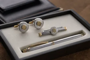
Luxury packaging for corporate gifts is not only about appearance. In B2B buying, it affects how a gift is received, how a brand is remembered, and whether the total presentation feels considered or generic. For men’s corporate gifting in particular, buyers usually want packaging that feels structured, understated, and premium rather than decorative or excessive. From our manufacturing perspective, the right packaging combines material quality, controlled branding, protective structure, and a consistent unboxing flow that supports the value of the gift inside.
If your gifting program includes custom metal accents, presentation hardware, branded plates, or elevated closure details, premium packaging accessory manufacturing support becomes part of the decision, not an afterthought. We often help buyers align packaging accessories with the gift itself by reviewing finish compatibility, logo execution, attachment methods, sample approval, and production consistency, especially when the box must match a premium object such as a metal desk gift, engraved accessory, or curated executive set.
What luxury packaging means in men’s corporate gifting
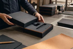
In practical terms, luxury packaging means controlled quality across structure, material, finish, and presentation details. It does not always mean the most expensive box. A well-made rigid setup box with dark textured wrap paper, a clean foil logo, and a fitted insert can feel more premium than a larger package with too many finishes competing for attention.
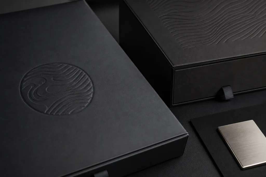
For men’s corporate gifts, the luxury effect usually comes from restraint. Buyers commonly prefer charcoal, black, navy, deep brown, brushed metallic accents, and precise logo placement. The packaging should feel intentional in the hand: solid when lifted, smooth at touch points, neat at corners, and quiet when opened. These small signals matter because corporate recipients often judge quality before they even interact with the item itself.
We advise buyers to define luxury packaging in relation to the gift category, recipient profile, and distribution method. A boardroom presentation gift has different needs from a distributor gift set, a VIP event drop, or an annual client appreciation box. The packaging should support the brand message without creating unnecessary cost or shipping complexity.
Why premium packaging changes perceived value and brand image
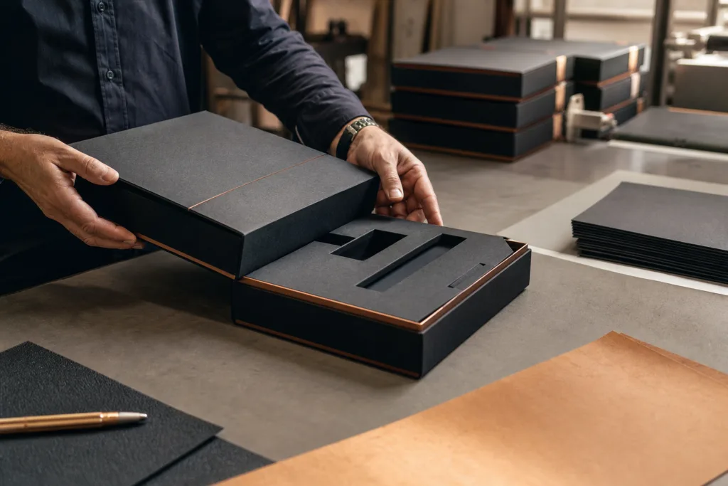
Corporate gifts are part object and part message. Even when the gift product is excellent, weak packaging can reduce perceived value. Thin board, poor fit, uneven logo finish, and generic inserts make a premium item feel less deliberate. On the other hand, good packaging helps the recipient slow down, notice the brand, and understand that care went into the selection.
This matters especially when the gift contains metal products or executive accessories. A solid product such as a pen set, nameplate, card holder, or paperweight often benefits from packaging that mirrors its weight and finish. If the item is cool-toned, polished, or brushed, the box design can echo that through foil, metal nameplates, or understated closure hardware.
Brand perception is also influenced by consistency. Procurement teams should think beyond a single sample and consider how 500 or 5,000 units will look together. Luxury packaging only works when color tone, lid fit, edge wrapping, insert cut accuracy, and logo application remain stable across the full run. That is why production planning matters as much as design inspiration.
Current design trends in men’s corporate gift packaging
Current trends in men’s gifting lean toward minimalist styling rather than ornate decoration. Buyers frequently choose dark monochrome palettes, subtle contrast textures, and metallic accents used in a controlled way. The finish should support the product story, not overpower it.
Minimalist styling and dark tones
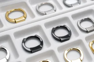
Black, graphite, deep green, midnight blue, and warm brown are common choices because they work across industries and age groups. They also pair well with metal finishes such as nickel, gunmetal, matte gold, and antique brass. Minimalist layouts with one strong brand mark usually feel more premium than crowded exterior printing.
Metallic accents with purpose
Metallic effects are especially relevant when the gift inside already carries a refined hardware or metal component. For example, engraved metal business card holders often look stronger in packaging with a brushed silver or muted gold detail rather than bright, reflective foil on every panel. The packaging and the product should speak the same visual language.
Personalization and recipient relevance
Another strong trend is controlled personalization. This can include name cards, monogram initials, personalized message inserts, or department-specific color coding inside a standardized outer box. For B2B buyers, this is often a smarter route than changing the entire structure for each recipient group.
Best packaging structures for men’s corporate gifts
Packaging structure is one of the biggest drivers of perceived quality, shipping performance, and packing efficiency. The right choice depends on gift size, weight, fragility, and presentation style.
| Structure | Best Use | Luxury Signal | Key Watchout |
|---|---|---|---|
| Rigid box | Premium single gifts and formal presentation | Strong hand feel and sharp shape | Higher shipping volume |
| Drawer box | Curated sets and layered reveal | Smooth unboxing sequence | Tray fit must be precise |
| Magnetic closure box | Executive sets and reusable storage | Clean opening and premium structure | Magnet alignment is critical |
| Sleeve plus inner box | Brand storytelling with cost control | Good visual layering | Sleeve scuffing can show quickly |
| Presentation case | High-value items, awards, desk pieces | Display-ready impression | Insert and hinge quality matter |
Rigid boxes
Rigid boxes are a dependable choice when buyers want a premium feel without overcomplicating assembly. They work well for one hero item or a compact curated set. If the gift is substantial, such as custom metal paperweights for client gifting, rigid construction helps the package feel proportionate to the weight inside and reduces the risk of a weak first impression.
Drawer boxes
Drawer boxes create a slower reveal. This is useful when there are multiple components such as the gift, card, certificate, and accessory compartment. They also support better insert organization. However, the pull action must feel smooth rather than loose, and the tray should not catch on the sleeve edges.
Magnetic closure boxes
These are popular for executive gifting because they combine structure with easy opening. When designed well, they feel neat and reusable. From a production standpoint, the hidden magnet placement, board thickness, and wrap tension all need attention. If any of these are off, the box can appear slightly twisted or fail to close cleanly.
Presentation cases
Presentation cases are suitable when the gift will remain stored or displayed in the box. They work well for recognition pieces, commemorative objects, and structured gift sets. In these projects, the insert design is just as important as the outer shell.
Premium materials and finishes that signal quality
The material and finish combination determines much of the tactile impression. For luxury packaging for corporate gifts, we usually recommend starting with the substrate and wrap material before discussing decorative effects. A beautiful foil logo cannot compensate for weak board or poor wrap quality.
Textured paper and specialty wraps
Textured paper can add depth without visual noise. Fine linen, leather-like grains, and matte uncoated wraps are common choices for men’s gift packaging. These surfaces photograph well, hide minor fingerprints better than glossy finishes, and pair naturally with metal elements.
Soft-touch lamination
Soft-touch surfaces create a refined hand feel, especially on dark colors. They are effective for brands wanting a modern premium look. The main consideration is scuff resistance. If the box will travel through multiple handling stages, buyers should test the finish during sampling rather than judging only from a visual mockup.
Foil stamping, embossing, and debossing
Foil is most effective when used sparingly. One logo, a short line of text, or a subtle border can be enough. Embossing and debossing can add a more understated premium effect because they rely on shadow and depth rather than shine. For conservative industries, debossing on a dark textured wrap often feels more sophisticated than bright foil.
Metal nameplates and custom hardware
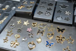
For some projects, especially where the gift itself includes metal or engineered parts, a custom plate or badge on the packaging creates a stronger connection between product and presentation. This is where Gairun can add value as a manufacturer, because packaging presentation is sometimes improved by custom metal logos, etched plates, die-cast emblems, or engraved accessories developed alongside the gift. The key is proportion: the metal component should feel integrated, not attached as decoration without purpose.
How to match packaging with different gift types
Packaging should reflect not only brand positioning but also the specific product category. A mismatch between gift and box is one of the fastest ways to lose the luxury effect.
Metallic products and desk accessories
Heavy or finely finished items need stable inserts and enough board strength to avoid flex. Executive desk pieces, engraved accessories, and metal display items benefit from dense foam, velvet-covered trays, microfiber lining, or precision-cut paperboard inserts. If the package includes premium executive desk gift sets, internal organization becomes critical so each component stays aligned after transport.
Leather goods
Leather gifts often pair well with warm neutrals, dark browns, matte black, and understated gold or blind embossing. The packaging should not be too industrial if the product is soft and tactile. A textured paper or soft-touch box with a neat reveal usually works better than highly reflective metallic surfaces.
Tech gifts
Tech items usually suit sharper geometry, monochrome color systems, and cleaner graphic hierarchy. Buyers should pay close attention to insert tolerances so that chargers, cables, manuals, and accessories do not shift. If the device surface is delicate, the insert lining must be tested for abrasion.
Drinkware and bar accessories
These products often need stronger edge protection and anti-movement inserts. If the gift includes metal bottle openers, whiskey stones, or bar tools, buyers may want a packaging look that balances masculinity and hospitality: dark board, satin lining, and a restrained metallic brand detail.
Personal accessory sets
For cufflinks, tie bars, pens, and similar combinations, packaging should feel compact and curated rather than oversized. In many cases, refined men’s accessory gift sets are elevated more by insert precision and coordinated finish language than by adding more print or structural complexity.
Branding details that improve the unboxing experience
Luxury unboxing is built from sequence and control. The recipient should immediately understand where to look, what to touch, and how to open the presentation without confusion.
Logo placement and hierarchy
The logo should usually appear in one dominant position on the outer box and then be repeated more quietly inside. Too many logo placements can make the box feel promotional rather than premium. For men’s corporate gifting, restraint usually creates more authority.
Insert design and reveal flow
The insert is not only functional. It directs attention. A recessed platform can make a small item feel important. A finger notch can improve removal without disturbing the arrangement. A top card can hide the gift for one extra reveal step. These are simple design choices, but they change the emotional pace of unboxing.
Message cards and private label details
Message cards, authenticity notes, welcome letters, and recipient name cards add relevance when they are printed well and kept visually consistent with the outer box. Private label buyers should make sure card stock, typography, foil tone, and insert color are all reviewed together during sampling rather than approved separately.
Production considerations for B2B buyers
Good packaging decisions are made early, before artwork is finalized and before purchasing schedules become tight. In our production work, the most efficient projects are the ones where structure, finish, accessory details, and shipping method are discussed together.
Artwork preparation
Buyers should confirm dielines, bleed areas, safe zones, foil position tolerance, emboss depth expectations, and logo file format before sampling starts. If a box includes both printed graphics and metal accessories, dimensions and mounting points should be checked in the same review cycle.
Sampling and approval
A visual mockup is helpful, but a physical sample is much more valuable for luxury packaging. We recommend checking board rigidity, corner wrapping, insert fit, opening resistance, color tone under natural light, and how the product sits after transport simulation. If the gift has sharp metal edges or significant weight, the sample should also be packed and handled as it would be in distribution.
MOQ and lead time
Luxury packaging often has higher minimums than simple folding cartons because of setup time, tooling, manual finishing, and material purchasing requirements. Lead time also depends on finish complexity. A plain rigid box may move faster than one with multiple foils, hidden magnets, custom metal plates, and layered inserts. Buyers should request a realistic timeline that includes sample revision and not only mass production days.
Quality control checkpoints
QC should include exterior finish consistency, wrap alignment, corner bonding, magnet function, insert adhesion, logo placement, scratch resistance, and packing accuracy. When the gift and the packaging are developed together, it is also useful to check how the item sits after vibration and repeated opening. The luxury effect is lost quickly if the insert loosens or the product shifts in transit.
Common packaging mistakes that reduce the luxury effect
One common mistake is using too many premium signals at the same time. Heavy texture, bright foil, embossing, ribbon, glossy inner print, and a metal badge can easily compete with each other. Luxury usually comes from editing, not adding.
Another mistake is ignoring proportion. A very large box around a small item can feel wasteful instead of generous. The opposite is also true: if a heavy metal gift is packed in a light box, the mismatch reduces confidence immediately.
Buyers also sometimes approve packaging based on a flat artwork concept without reviewing material performance. Dark soft-touch surfaces may look elegant in a rendering but show marks in real shipping conditions. Similarly, an insert that looks neat when first assembled may fail after repeated handling if the cavity tolerance is too loose.
A final mistake is treating the gift and the packaging as separate sourcing decisions too late in the process. When premium products and premium packaging are developed in isolation, finish mismatch, size conflict, and branding inconsistency become more likely.
A practical checklist for choosing the right packaging
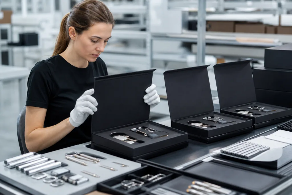
- Define the recipient type and gifting context before choosing finishes.
- Match structure to product weight, fragility, and presentation style.
- Limit the number of decorative effects so the package stays controlled.
- Review material samples in person whenever possible.
- Test inserts with the actual product, not only a dimension drawing.
- Confirm whether the packaging must support shipping, hand presentation, or both.
- Check logo scale, metallic tone, and print hierarchy on the outer and inner pack.
- Include sample review time in your launch schedule.
- Plan QC around both appearance and functional performance.
- Consider whether custom metal accents can strengthen the brand story without overcomplicating cost.
Conclusion
Luxury packaging for corporate gifts works when every element supports the same impression: the box structure feels substantial, the materials are appropriate to the gift, the branding is controlled, and the unboxing flow feels intentional. For men’s corporate gifting, that usually means balancing dark palettes, precise metallic details, durable materials, and inserts that present the product with confidence. From our manufacturing perspective, the strongest results come from developing packaging and product presentation together so that finish, fit, protection, and brand expression are aligned from sampling through bulk production.
FAQs
How do I choose the right box structure for a men’s corporate gift?
Start with the product’s weight, size, and presentation goal. Rigid boxes are a strong option for premium single items, drawer boxes work well for layered gift sets, and magnetic closure boxes suit executive presentations where reuse matters. The right choice should protect the item, feel proportionate in hand, and support a clean unboxing sequence rather than adding complexity for its own sake.
What finishes usually feel premium without looking excessive?
For most men’s corporate gift packaging, textured paper, matte or soft-touch surfaces, debossed logos, restrained foil stamping, and subtle metallic accents create a premium effect without feeling overdesigned. The key is finish discipline. One or two well-executed effects usually feel more luxurious than combining many treatments on the same box.
Are metal nameplates or badges on packaging worth adding?
They can be, especially when the gift itself includes metal elements or when the brand wants a stronger engineered look. A custom metal plate can connect the packaging to the product inside, but it should be sized carefully and mounted securely. If the plate is too large, too shiny, or unrelated to the overall design language, it can reduce rather than improve the luxury impression.
What should buyers check during packaging sample approval?
Review more than the printed artwork. Check board strength, corner wrapping quality, insert fit, lid alignment, magnet closure performance, finish consistency, scratch visibility, logo placement, and how the actual gift sits inside after handling. If the packaging will be shipped, test how it performs after movement so the unboxing experience remains clean when it reaches the recipient.
How do MOQ and lead time affect luxury packaging decisions?
Premium packaging often involves higher minimums and longer timelines because rigid construction, specialty materials, foil, magnets, inserts, and custom metal accents all add production steps. Buyers should confirm whether quoted lead time includes sampling, revisions, and final packing, not only box manufacturing. Early planning helps avoid cutting important quality details just to meet a deadline.
How can I make luxury packaging for corporate gifts feel branded but not overly promotional?
Use a clear hierarchy. Keep the outer logo focused and minimal, repeat branding more quietly inside, and let materials, color, and structure carry most of the premium message. A well-placed logo, a strong insert design, and a thoughtful message card often create a more executive result than large graphics or repeated slogans across every surface.