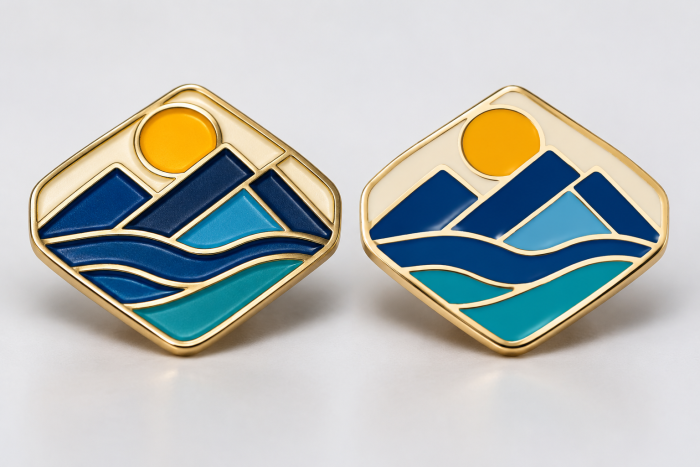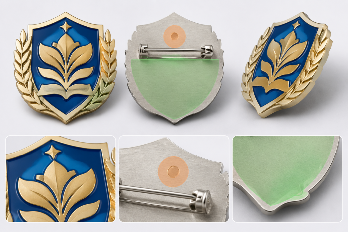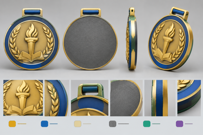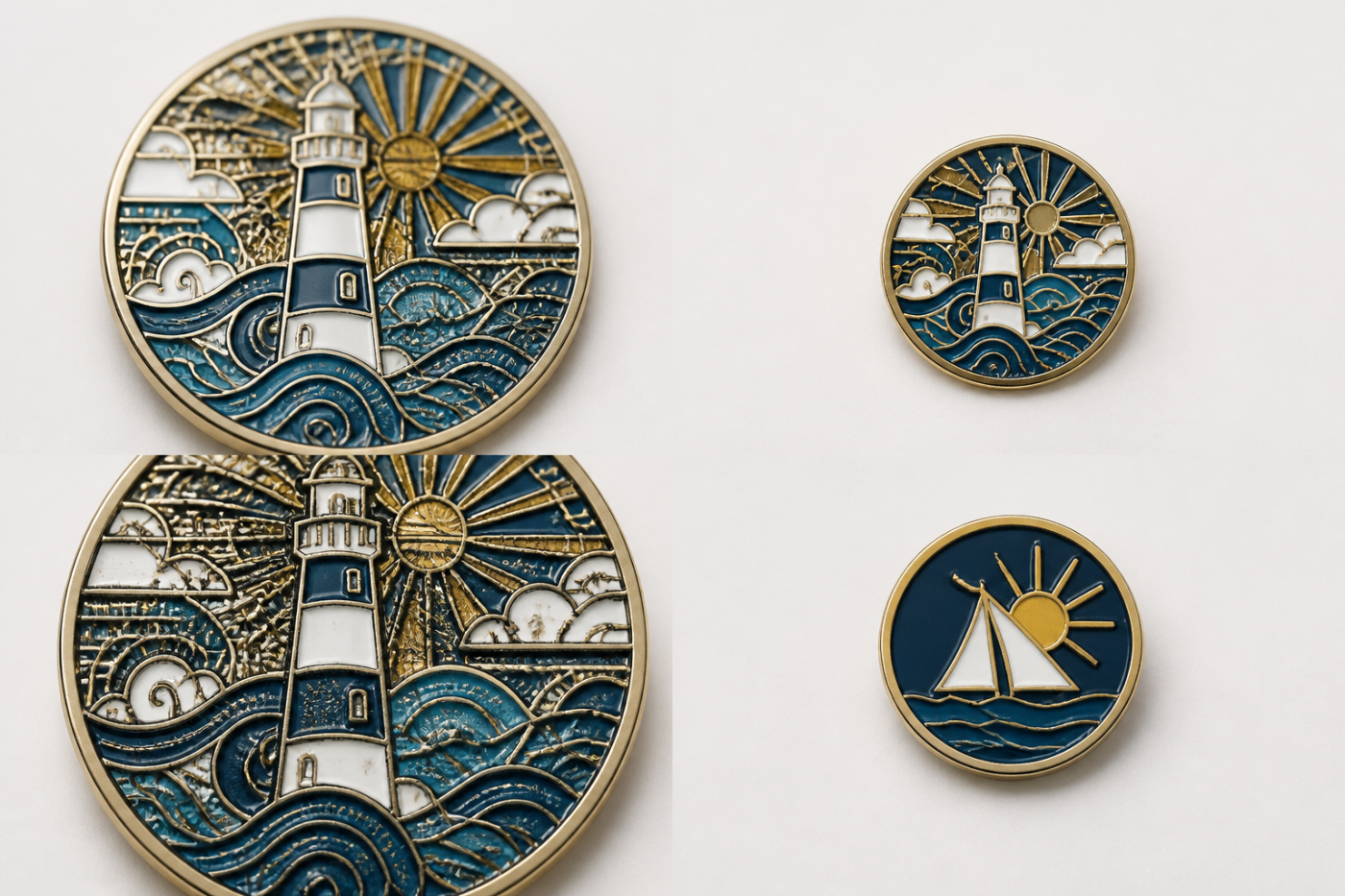
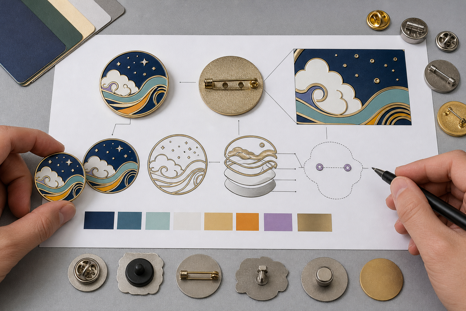
The most useful enamel pin artwork guidelines begin with one action: inspect the design at its intended finished size. Do this before refining textures, adding outlines, or selecting decorative effects. For Custom Lapel Pins and Badges, readable artwork usually combines a clear focal symbol, short text, intentional metal borders, and controlled color areas. If fine illustration, several tones, or gradients must remain visible, a printed-detail route may deserve review instead of forcing every mark into an enamel cell.
An enlarged vector file can look precise while hiding the problems that matter on the finished pin. Buyers should therefore supply the intended dimensions, identify the details that must remain readable, and treat production-method selection as part of artwork development.
Enamel Pin Artwork Guidelines: Start With a Final-Size Readability Audit
Begin by displaying or printing the artwork at the intended finished dimensions. Do not judge it only at a comfortable design-screen magnification. Reduction can reveal collisions between letters, cramped internal spaces, weak separation between adjacent shapes, and lines that no longer contribute to recognition.
Use a simple priority sequence. First, identify the primary symbol or message. A buyer should be able to recognize that element before noticing decorative details. Second, inspect the smallest wording, narrowest gaps, and most delicate internal shapes. Third, flag anything that merges, disappears, or competes with the focal element.
Legibility is different from technical presence. A thin stroke may still appear in the file, but it has little communication value if viewers cannot recognize its role at the intended viewing distance. The same principle applies to letters. A word is not successful merely because every character remains somewhere in the reduced artwork.
Revise in a practical order:
- Enlarge, shorten, or remove critical wording that cannot be read comfortably.
- Simplify fine internal contours while preserving the recognizable silhouette.
- Increase separation between neighboring letters, shapes, and color areas.
- Remove details that do not support identity, meaning, or visual hierarchy.
Gairun can begin an artwork assessment from vector artwork, a usable PDF, or a hand-drawn concept. The file should be accompanied by intended dimensions, exact wording, color references, front and back instructions, and the intended pin format when available. A pre-tooling engineering assessment may then consider dimensions, relief, metal borders, color areas, attachments, and the proposed production method. The exact checkpoints depend on the artwork and product structure.
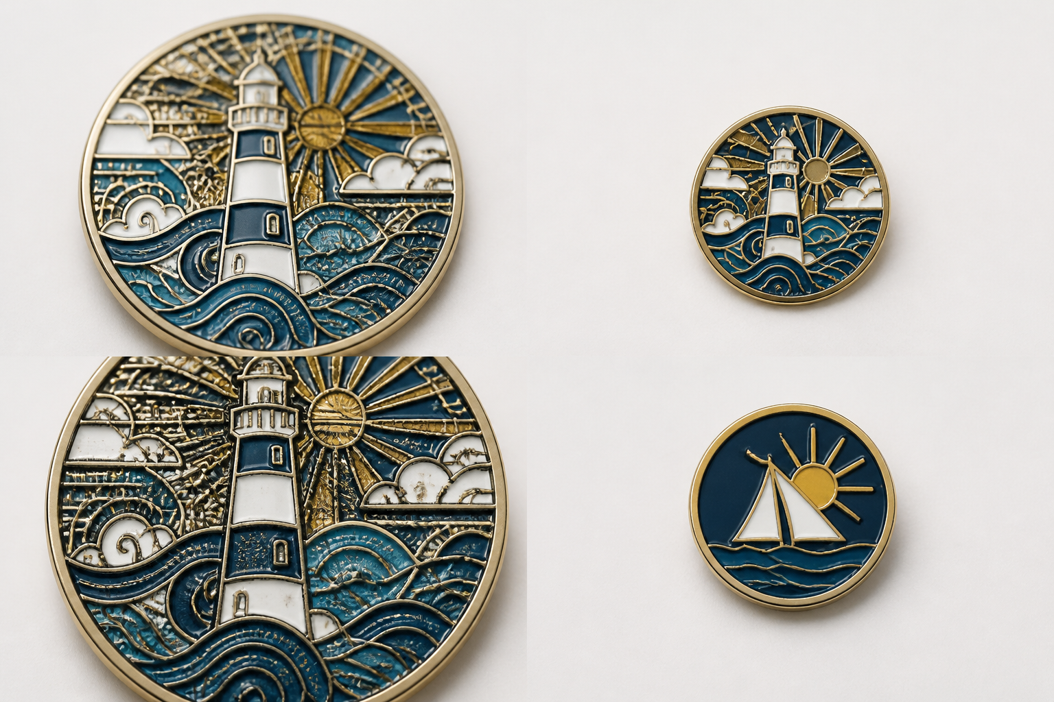
Turn Fine Lines Into Clear Metal Borders and Color Areas
Fine lines in enamel artwork need defined jobs. Some separate two colors. Others outline an important shape, represent a critical symbol, or add decorative texture. Classify each line before deciding whether to retain it. A line without a clear communication or structural role is usually the first candidate for removal.
Soft enamel leaves colored areas recessed below surrounding raised metal borders. Imitation hard enamel creates a smoother face, bringing the color and metal areas closer to one level. Both approaches still need controlled enamel pin color areas and intentional metal boundaries. Buyers comparing these surface directions can also consult Soft Enamel vs Hard Enamel Pins: Finish, Detail and Cost Tradeoffs.
Do not automatically convert every vector boundary into a separate enamel cell. Ask whether neighboring colors remain visually distinct after a metal border is introduced. Too many small cells can fragment a logo or illustration. Crowded artwork can often be improved by merging areas with the same visual role, removing secondary outlines, or replacing repeated texture with one larger symbolic feature.
A small area may instead be marked for printing review when its defined graphic detail must remain visible. That decision should be coordinated with the base surface, surrounding enamel, color layout, and intended use rather than assumed from the artwork alone.
Use annotations that distinguish:
- exposed metal and plated areas;
- each enamel color field;
- intentional open gaps or recessed areas;
- lines that must form metal boundaries;
- details proposed for screen or UV printing.
No universal enamel pin minimum line width is appropriate for every design. The workable result depends on final size, process, base form, relief, and the relationship between nearby features. Final-size inspection and an artwork-specific engineering assessment are therefore more reliable than applying an unsupported generic number.
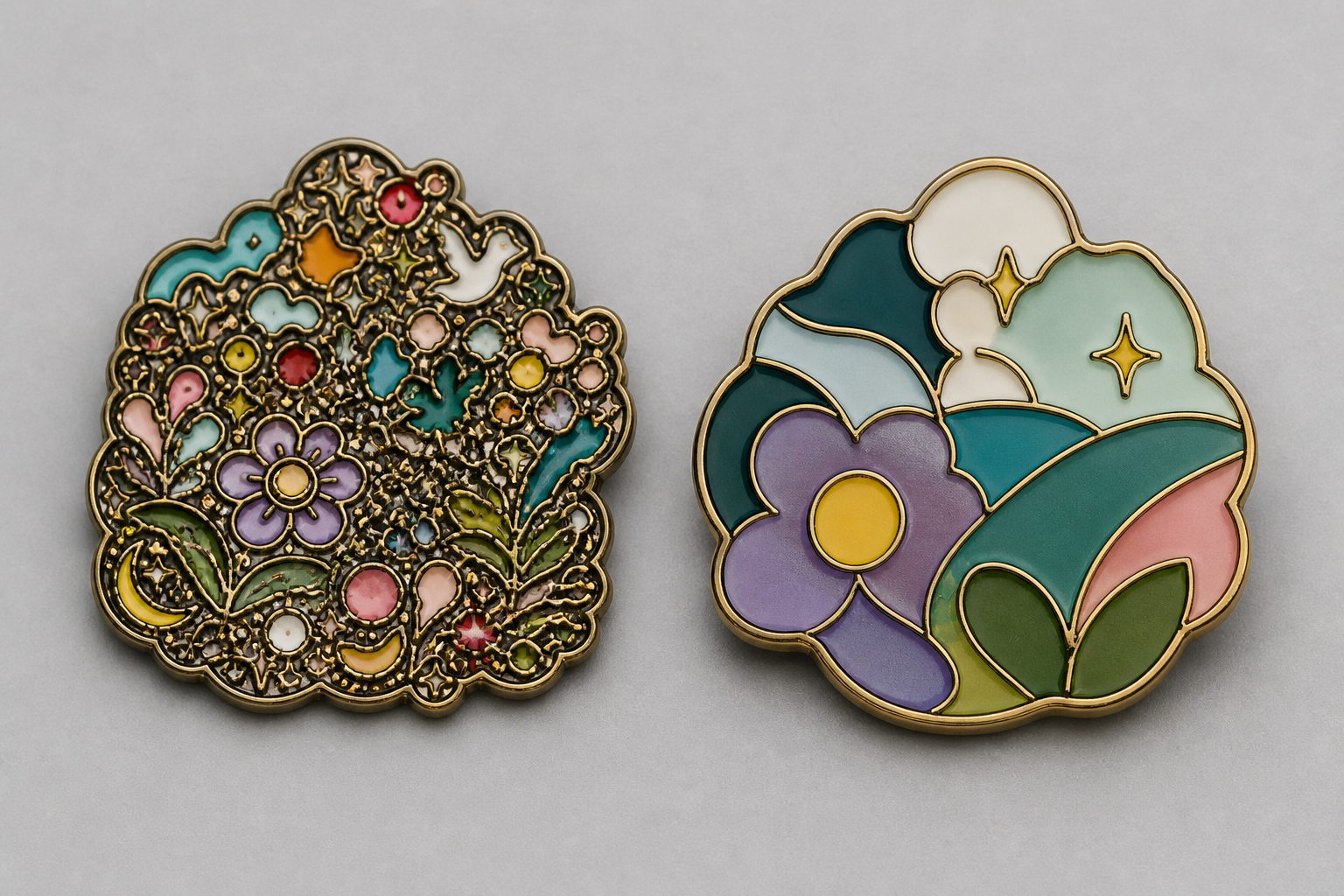
Make Small Text, Counters, and Negative Space Survive Reduction
Small text enamel pins are most vulnerable when the type uses thin strokes, condensed letterforms, tight tracking, or small enclosed spaces. Curved placement and textured backgrounds can add further visual competition. A typeface that looks refined in a large presentation may become a row of indistinct marks after reduction.
Triage the wording according to its purpose. Retain the brand name, short identifier, or essential event wording. Abbreviate supporting copy where the meaning remains clear. Longer explanatory information can move to a backing card or other accompanying material when appropriate. Decorative microcopy that does not affect recognition can be removed.
Negative space is an active design feature. The counters inside letters such as A, B, D, O, P, and R need to remain visually open. Gaps between letters, borders, and neighboring symbols also need enough separation to remain distinct. Enlarging type without opening those spaces may simply create a larger but still crowded wordmark.
A dense crest, map, or architectural illustration benefits from the same approach. Preserve the outer silhouette and a few defining interior features. Remove repetitive windows, contour lines, masonry marks, or ornamental strokes that do not change recognition. If an architectural emblem is recognized by its roofline, central opening, and two side towers, those features should take priority over every small facade detail.
Before: a condensed wordmark surrounded by several outlines, narrow counters, and repeated texture.
After: shorter wording, more open letterforms, one intentional outer border, and a simplified supporting symbol.
This is not a universal size formula. The production route for pins and badges depends on the complete design, including shape, relief, text, color layout, surface appearance, and attachment. Typography should therefore be assessed with the whole pin rather than approved as an isolated graphic layer.
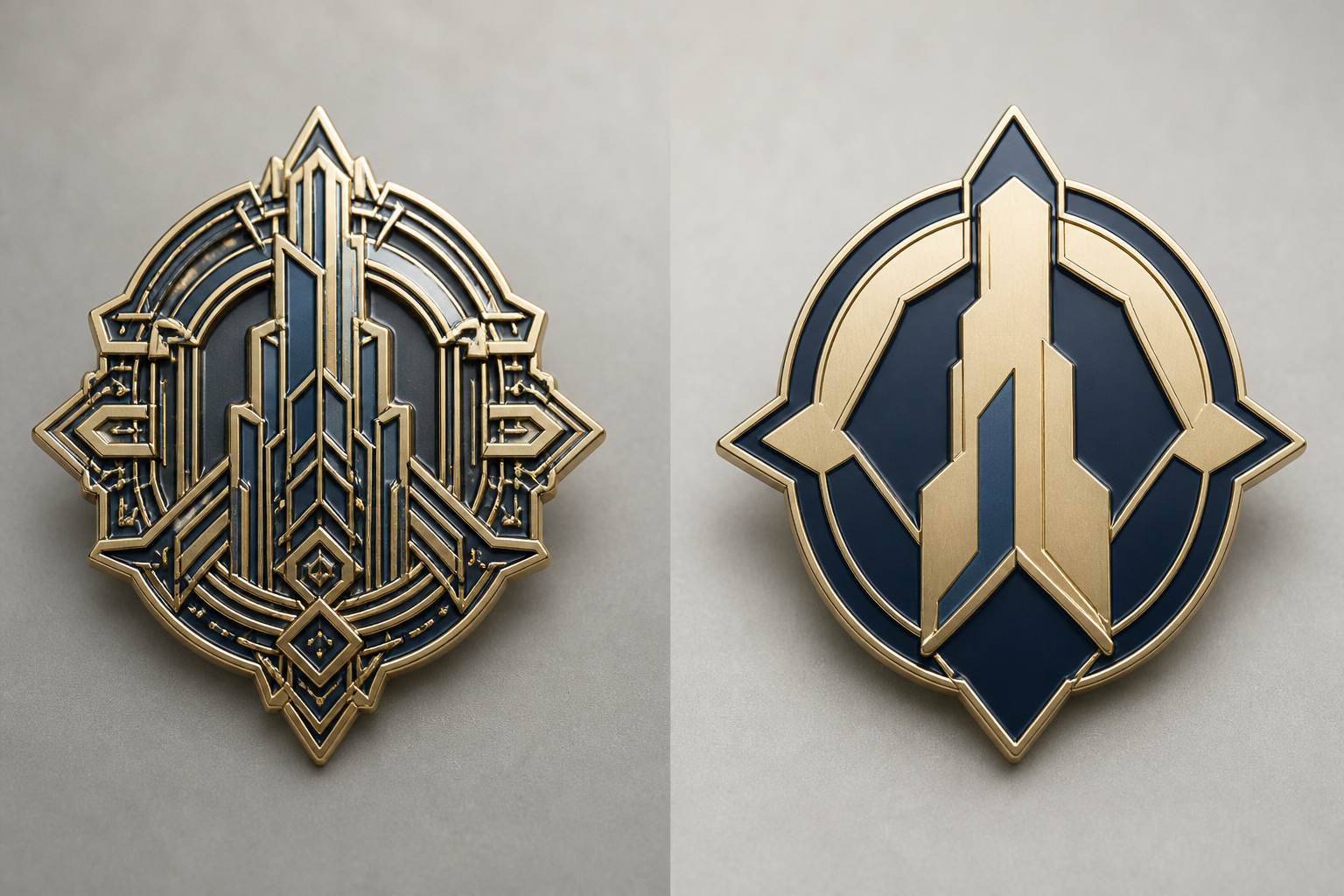
Choose Enamel or Printed Detail Based on What the Artwork Must Preserve
Enamel is naturally aligned with artwork organized into controlled color fields separated by metal borders. This is an artwork-structure observation, not a universal quality ranking. Printed metal badges follow a different visual and production logic, so the routes should not be treated as interchangeable.
| Observable artwork input | What must remain readable | Initial decoration direction to review | Why it fits | Variable requiring project confirmation |
|---|---|---|---|---|
| Bold, separated color blocks with open shapes | Logo silhouette and short wording | Soft or imitation hard enamel | The design already forms controlled cells with intentional metal boundaries | Final dimensions, smallest text, relief, and finish direction |
| Fine recessed emblem details within a metal form | Selected interior symbols and contour relationships | Simplified formed detail, enamel, or a combined printed-detail assessment | Critical features can be prioritized while secondary contours are removed | Base metal, forming route, relief, and width of surrounding areas |
| Several tones or a gradient | Tonal transition and fine illustration | UV printing review | UV printing can be considered for printed detail or multiple tones | Surface preparation, color layout, use conditions, and required evidence |
| Defined graphic marks intended to stay printed | Clean graphic edges rather than enamel cells | Screen printing review | Screen printing can apply defined details to a prepared metal surface | Prepared surface, graphic layout, finish, and order specification |
For a compact logo built from bold, separate color blocks and a short, open wordmark, an enamel route is a logical starting point. The artwork already provides color cells and metal boundaries. Final dimensions, the smallest lettering, relief, and finish can still change that direction during production assessment.
For a pin with fine recessed illustration, several tones, or a gradient that must remain visible, printed detail deserves early consideration. Converting every mark into an enamel cell may overload the design and weaken its hierarchy. The base form, surface preparation, color arrangement, and required use conditions may alter the recommendation.
Gairun offers screen printing for defined graphic details on a prepared metal surface and UV printing for artwork requiring printed detail or multiple tones. Neither process should be assigned a particular resolution, abrasion resistance, photographic result, or colorfastness without an order-specific specification or supporting test evidence. These decoration choices form one part of the broader Custom Gifts and Promotional Metalwork development process.
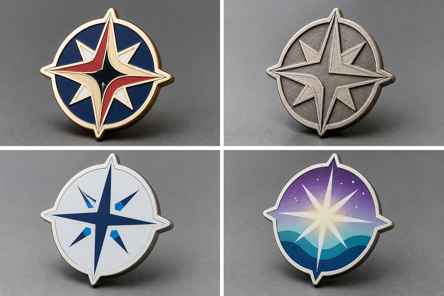
Protect Contrast and Hierarchy Without Adding Unreadable Detail
After simplifying the linework and text, use contrast to reinforce the reading order. The artwork should have one focal message, a limited group of supporting elements, and a background treatment that does not compete with them. Adding an outline around every object often creates more visual noise instead of greater clarity.
Inspect neighboring enamel pin color areas as pairs. If two adjacent colors do not separate clearly, exposed metal may define the boundary more effectively than another colored field. Conversely, unnecessary metal outlines can divide a single visual shape into fragments. The right choice follows the role of each area, not the number of paths in the source file.
Surface treatment can support hierarchy but should not be expected to repair weak artwork. Sandblasted or matte areas may be considered to reduce shine or create surface contrast. Suitability depends on the artwork, base metal, forming route, and width of the treated area. An exact texture or gloss level requires an approved specification or sample.
Plating direction must also be coordinated with exposed metal, relief, and the surrounding colors. Gairun lists gold, silver, nickel, black nickel, antique bronze, and antique silver as plating directions. Final tone and feasibility depend on the artwork, base metal, relief, and visible metal areas. Artwork alone does not establish plating thickness, performance, or an exact visual result.
Before approving the hierarchy, check four points:
- One symbol or message clearly leads the design.
- Adjacent colors and exposed metal have intentional separation.
- Secondary detail supports recognition instead of competing with it.
- Texture, plating, and background treatment do not obscure text or symbols.
Approve a Production-Ready Artwork Proof, Not Just an Attractive File
A visually attractive presentation is not automatically production-ready. The artwork proof should capture the decisions needed to interpret the design without guessing. Buyers should mark unresolved choices for engineering discussion rather than allowing assumptions to become hidden specifications.
Use this proof checklist:
- intended finished dimensions and orientation;
- all wording, spelling, punctuation, and capitalization;
- front and back instructions;
- color references and the boundaries of every color field;
- exposed-metal and plated areas;
- intentional borders, gaps, and recessed sections;
- details assigned to enamel, screen printing, or UV printing;
- finished outer shape and any relief direction;
- attachment type, position, and orientation.
Request focused attention on the smallest text, narrowest gaps, fine internal details, and every meeting point between colors and exposed metal. Gairun's pre-tooling assessment may cover these features alongside dimensions, relief, attachments, component positions, and the proposed manufacturing method.
Artwork approval and later authorization should remain distinct control points. Gairun's service path separates requirement intake, artwork and engineering assessment, optional sample planning, production coordination, packaging, and shipment preparation. Approving one stage should not be treated as blanket approval for every later stage. More company and manufacturing context is available through About Gairun and the Factory.
A useful RFQ can also include product type, quantity, design variants, finish, color treatment, packaging, destination, and required schedule. Missing technical choices can be clearly marked for discussion rather than invented or treated as final instructions.
Use Readability as the Final Artwork Decision Rule
The final decision rule is straightforward: retain only the details that remain understandable at the intended pin size. A recognizable symbol, short readable text, intentional metal borders, and controlled color areas are more useful than a dense illustration that succeeds only when enlarged.
Submit the final-size artwork with dimensions, exact wording, color references, front and back notes, and a clear list of details that must remain readable. Gairun Custom Zinc Manufacturing can then assess the artwork and proposed production direction against the actual pin structure before tooling coordination.
Frequently Asked Questions
Why does enamel pin artwork look different when viewed at final size?
Reduction changes the visible relationship between strokes, gaps, counters, borders, and color areas. Details that look separate in enlarged vector artwork may merge or compete when shown at the intended pin dimensions.
Can very small text be used on an enamel pin?
Small text can be considered, but readability depends on the final dimensions, letterform, spacing, surrounding artwork, and production route. Essential wording should be tested at final size and enlarged, shortened, moved, or removed when it cannot be recognized clearly.
Do adjacent enamel colors need a metal border between them?
Enamel artwork generally requires controlled color fields and intentional metal boundaries. The border arrangement should be assessed with the complete artwork because unnecessary divisions can fragment a shape, while missing boundaries can make the color layout unclear.
When should fine artwork be reviewed for printing instead of enamel color cells?
Printing deserves review when defined fine marks, multiple tones, or gradients must remain visible and converting every feature into a separate enamel cell would overload the design. The base surface, color layout, finish, and use conditions still require confirmation.
What details should be marked on an enamel pin artwork proof?
Mark the final dimensions, exact wording, front and back instructions, color references, exposed metal, intentional borders and gaps, relief direction, printed versus enamel details, outer shape, and attachment position.
Can a gradient or multi-tone illustration be used on a custom pin?
A gradient or multi-tone illustration can be assessed for a printed-detail route such as UV printing. Feasibility and appearance depend on the artwork, prepared surface, color layout, base form, use conditions, and the agreed order specification.