
The most reliable challenge coin front and back design starts with hierarchy, not decoration. Give each face one dominant job, then decide which details belong on the reverse, border, edge, packaging card, or nowhere. This approach helps buyers prepare a clearer brief for Custom Challenge Coins and reduces late changes to artwork, tooling, and presentation.
A crowded coin usually has too many elements with equal visual weight: several emblems, a long organization name, two dates, a motto, sponsor information, numbering, and decorative textures. The solution is not to shrink everything. It is to assign priorities before drawing and test the finished-size result in metal.
Use a Two-Face Content Hierarchy Before Drawing
Define the front as the immediate identity face. It may be led by one authorized emblem, organization mark, anniversary theme, or recognition symbol. The reverse should provide context, such as a service message, milestone, date, values, location, recipient field, or serial number.
Classify every requested element into four levels:
- Dominant subject: the symbol or theme that should be recognized first.
- Supporting message: a motto, service phrase, anniversary wording, or secondary symbol.
- Identification detail: dates, ranks, locations, version names, or numbers.
- Optional information: sponsor lines, long URLs, extra decorative marks, or copy that can move to packaging.
Apply four questions to each item: Should it stay, move, combine with another element, or be removed? Two faces should share the story rather than duplicate the same organization name, motto, and date.
| Observable input | Practical implication | Initial placement | Confirmation still needed |
|---|---|---|---|
| One official emblem | A single focal subject can establish identity quickly. | Center it on the front, with limited supporting text. | Artwork authorization and final proof authority. |
| Two competing emblems | Equal scale may make neither symbol dominant. | Choose one front emblem; place the other on the reverse or in a controlled secondary field. | Which organization has primary recognition status. |
| Long organization name | Full border text may consume the usable arc. | Use a short approved form, reverse placement, or packaging card. | Official wording and abbreviation approval. |
| Short motto | A concise phrase can support identity without competing with the emblem. | Place it in a lower arc, banner, or reverse field. | Lettering measurements at finished size. |
| Multiple dates | Several dates can look like unrelated decoration. | Keep the most important date near the reverse message; combine dates only when meaning remains clear. | Date format and historical accuracy. |
| Serial numbering | Variable data needs a flat, controlled area. | Reserve a reverse field away from heavy relief. | Number sequence, font, and personalization method. |
| URL or QR code | Small metal faces may not provide enough clear geometry. | Prefer a packaging card when the coin is information-heavy. | Physical scan test if the code remains on the coin. |
For military, public-safety, government, and association programs, the buyer should identify who may supply controlled emblems, names, ranks, and service messages. Gairun manufactures challenge and commemorative coins for these programs, but artwork authorization and endorsement must come from the appropriate buyer-side authority.
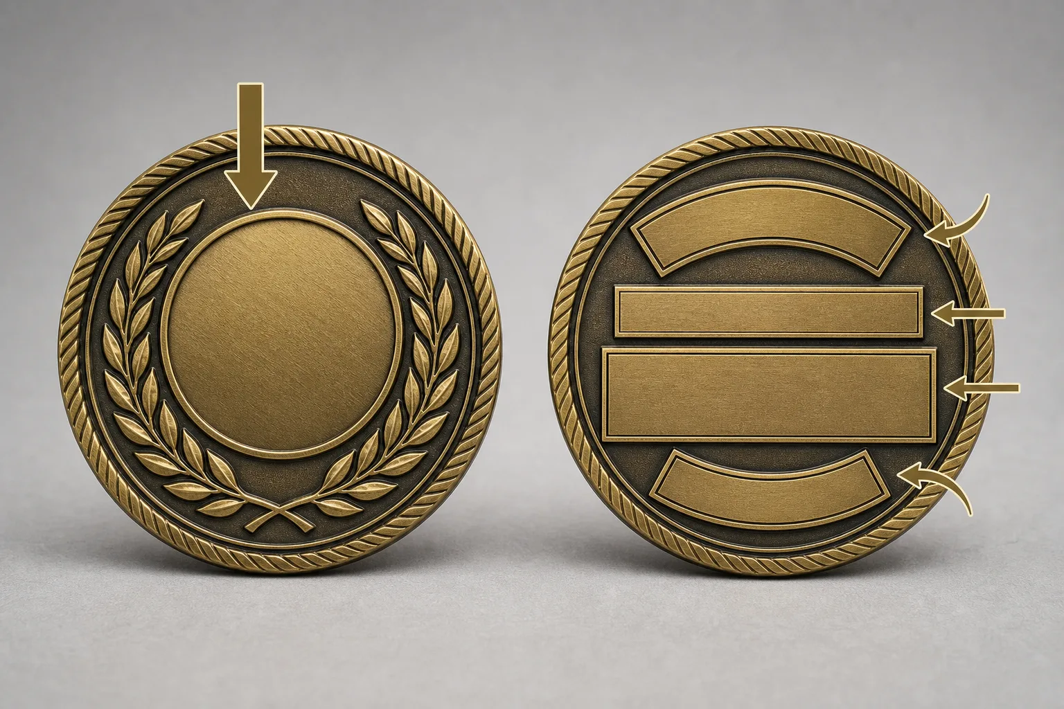
Plan the Front, Reverse, Border, and Edge as One Coin Structure
A challenge coin layout is not two independent circles with leftover content placed around the edge. The front face, reverse face, border, thickness, and edge must work as one structure.
Create an orientation diagram before final artwork. Mark the intended top of the front, the intended top of the reverse, and how the reverse should read when the coin is turned. This prevents upside-down wording, misplaced numbering, and mismatched visual direction.
Decide whether border text carries a primary message or merely identifies the organization. Do not automatically fill both borders because unused space is available. Border text should support the face hierarchy, not become a second paragraph.
Edge choices may include a plain edge, rope pattern, diagonal pattern, fine reeding, numbering, or reviewed edge text. These are contextual options, not automatic selections. The wording, continuity, orientation, and forming route must be confirmed before an edge treatment is treated as final.
Gairun’s engineering guidance checks front-to-back text direction, face alignment, border continuity, separator positions, and edge orientation. For detailed edge concepts, the buyer should also specify whether the pattern must continue around the full circumference and where it begins and ends. The Challenge Coin Edge Options guide can help structure those questions.
- Show front and reverse orientation on the same drawing.
- Mark the start point for any edge text or repeating pattern.
- Separate border wording from edge wording in the file.
- Check that separators do not collide with relief, enamel, or the edge treatment.
- Avoid repeating the full organization name, date, and motto on both faces unless repetition is intentional.
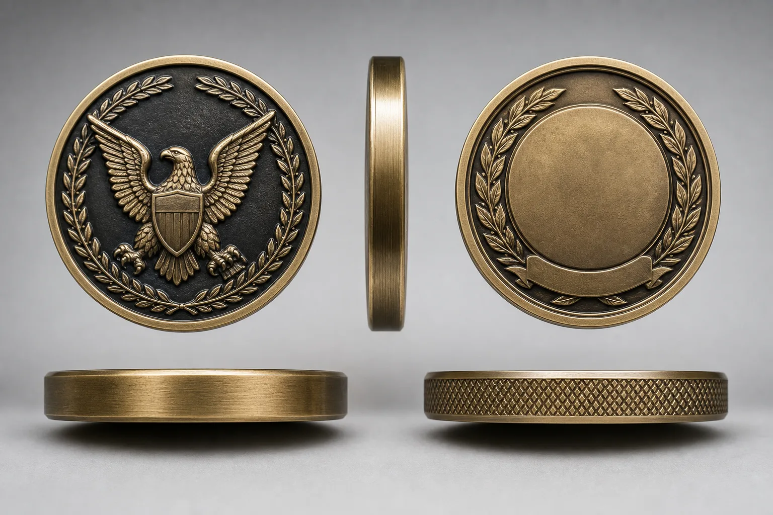
Build Hierarchy Through Emblem Scale, Relief, and Metal Borders
Physical construction should reinforce the graphic hierarchy. Make the primary emblem strongest through a combination of scale, position, silhouette, relief, or contrast. Making several symbols equally large usually produces competition rather than clarity.
Supporting symbols can sit in a ring, shield, banner, or recessed field when they remain distinguishable at the intended finished size. The artwork should identify which forms are raised, recessed, layered, or sculpted. Do not leave the relief order for production interpretation.
Relief can separate a primary subject from supporting fields through raised, recessed, layered, or sculpted forms. It does not create extra layout space. A detailed 3D focal subject may require more breathing room around it, leaving less room for nearby lettering.
Raised metal borders are useful around enamel fields and can preserve the silhouette of lettering or symbols. Soft enamel leaves color recessed below the surrounding raised metal. Imitation hard enamel brings color and metal areas closer to one level, but both approaches still require controlled color fields and clear metal boundaries.
Dual plating, local polishing, antique directions, matte fields, and sandblasted surfaces can also separate visual zones. Gairun lists gold, silver, nickel, black nickel, antique bronze, and antique silver as plating directions. Final tone and feasibility depend on the artwork, base metal, relief, and exposed areas. Dual plating requires clearly defined boundaries and is not suitable for every relief or geometry.
For a detailed raised-metal concept, buyers may also compare the visual logic with High-Relief and Dual-Plated Coins. The reference is useful for planning questions, not a promise that every proposed design uses the same construction.
Set Coin Lettering Size by Finished Scale, Not Screen Magnification
There is no single coin lettering size that works for every typeface, diameter, relief direction, finish, and forming route. Record the proposed capital height, lowercase height where relevant, narrowest stroke, counter opening, line spacing, and clearance from nearby relief in millimeters.
Inspect the artwork at 100% of the intended finished size. Use a magnified technical view afterward to locate narrow strokes, closed counters, compressed words, and crowded counters. A large screen view can make tiny text appear more usable than it will be on finished metal.
For limited fields and circular borders, prefer short wording, restrained abbreviations, and typefaces with open counters and uncomplicated strokes. If the copy does not fit, shorten lower-priority wording or move it to the reverse, certificate, or packaging card. Uniformly shrinking every word usually weakens the entire coin.
For circular challenge coin border text, estimate the available path with:
Circumference = π × finished diameter
Available arc length = circumference × usable arc angle ÷ 360
Then deduct margins, separators, edge clearance, and space occupied by other artwork. Fit the actual typeface and wording to the remaining path. Character count alone is unreliable because letter widths vary.
For information-heavy event giveaway coins, a URL or QR code may work better on a branded packaging card. A code placed on a small metal face needs physical testing at the proposed size, finish, contrast, viewing angle, and device conditions. No scan result should be assumed from a screen proof.
Gairun’s pre-tooling engineering review may cover dimensions, thickness, relief, metal borders, color areas, and the proposed production method. The checklist changes with the coin structure and artwork, so measurable lettering should be flagged early rather than discovered after tooling.
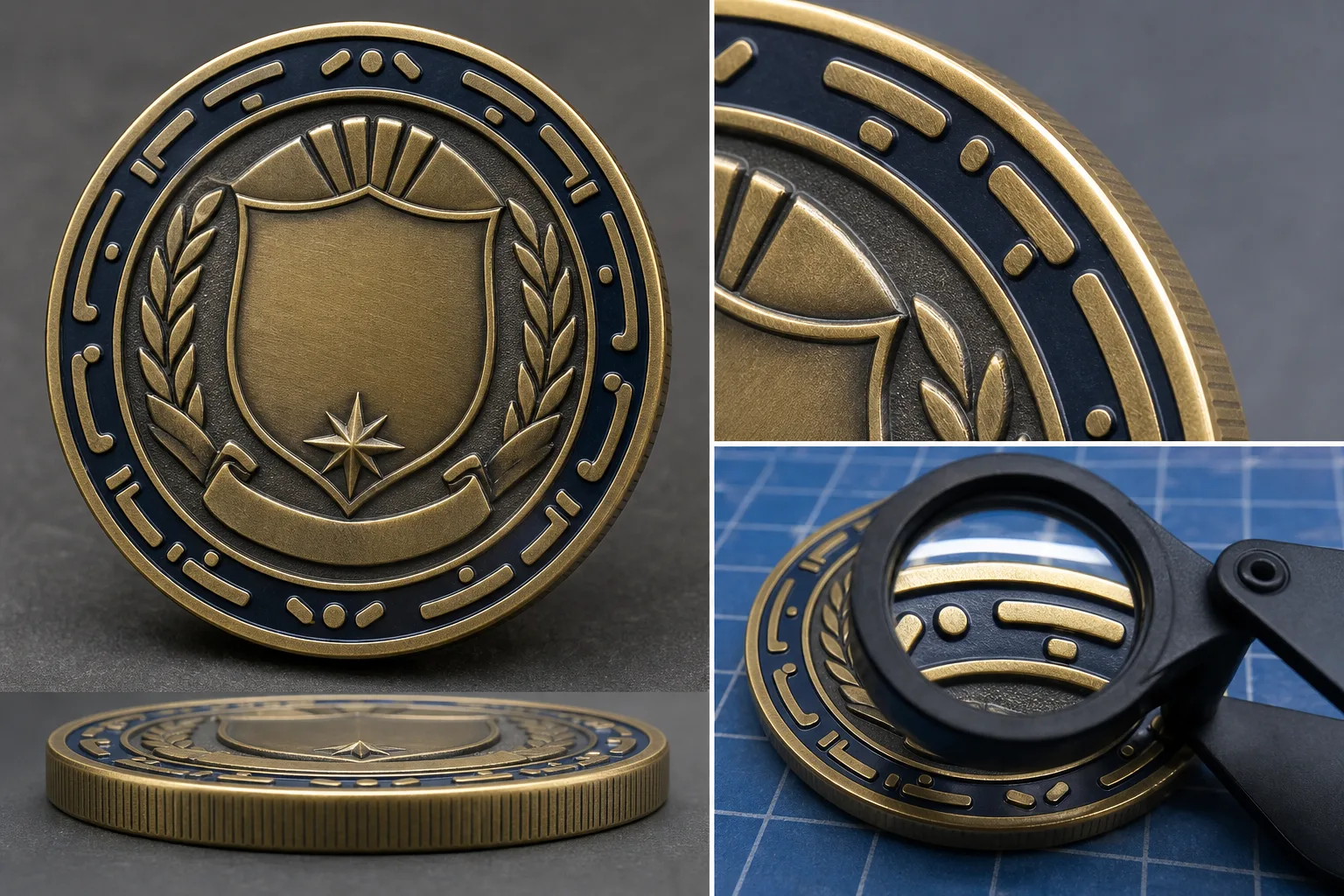
Use Negative Space and Surface Contrast Instead of Adding More Content
Empty space is an active part of the design. Protect a quiet zone around the dominant emblem and small lettering instead of filling every recessed field with texture. One controlled background texture can distinguish the field from raised subjects; several competing textures can recreate the original crowding.
Color should clarify identity or hierarchy. It does not need to outline every detail. Soft enamel can separate recessed color fields with raised metal borders. Imitation hard enamel can create a smoother relationship between color and metal. Relief-only metal, antique finishes, dual plating, matte areas, and printed detail each create a different type of separation.
Gairun offers UV printing for artwork requiring printed detail or multiple tones. Fine marks, gradients, and color layout need an artwork assessment. Photographic reproduction, outdoor life, and colorfastness should not be promised without supporting test evidence.
Sandblasting and matte finishing may reduce shine or create contrast. The exact texture and gloss level require an approved sample or written specification. Avoid placing dark antique effects, narrow polished borders, and several plating tones so close together that their boundaries become ambiguous.
If the program includes names, dates, or serial numbers, reserve a flat reverse area from the beginning. Confirm the personalization list, font, date format, numbering rules, and whether every variable item must appear on the coin. Recognition programs can often distinguish levels through finish color, edge treatment, or reverse wording without changing the dominant front message.
Compare Two Challenge Coin Front and Back Design Patterns
The following are hypothetical artwork patterns, not Gairun customer projects. They show how observable content can influence an initial recommendation.
Example 1: Official commemorative coin
The brief contains one authorized central emblem, an organization identity, a service message, one date, a secondary identifier, and consecutive numbering. The initial arrangement places the emblem and identity on the front. The reverse carries the service message, date, identifier, and a reserved numbering field. The edge remains a separate design decision rather than another place for long copy.
For this scenario, 38–50 mm diameter and 3–4 mm thickness are contextual planning ranges for official military, public-safety, government, or association commemorative coins. The scenario guidance favors brass, with copper or zinc alloy as alternatives. These values are not universal specifications. A complex sculpted emblem, unusual profile, or special edge requirement could change the forming and material recommendation.
Example 2: Corporate anniversary coin
The brief contains a brand mark, anniversary year, three milestones, a values statement, and a long URL. The initial arrangement places the brand or anniversary mark on the front. The reverse carries the milestones, values, and a unique number. The long URL moves to a packaging card instead of being reduced to crowded metal text.
For this scenario, 40–50 mm diameter and 3–4 mm thickness are contextual planning ranges for corporate anniversary or milestone coins. The scenario guidance favors brass, with zinc alloy or iron as alternatives. Gradients, many brand tones, complex 3D geometry, or a non-round silhouette could change the decoration or forming approach.
| Pattern | Visible crowding signal | Front role | Reverse role | Border or edge role | Variable that may change the recommendation |
|---|---|---|---|---|---|
| Official commemorative | Emblem, service wording, date, and number compete for attention. | Authorized emblem and organization identity. | Service message, date, identifier, and numbering. | Short identifier or intentional pattern; no automatic overflow copy. | Emblem authorization, sculpted depth, unusual profile, or edge continuity. |
| Corporate anniversary | Brand mark, milestones, values, and URL create dense copy. | Brand or anniversary theme. | Milestones, values, dates, or unique number. | Finish or edge treatment can distinguish versions. | Brand color rules, gradient dependence, non-round shape, or numbering uniqueness. |
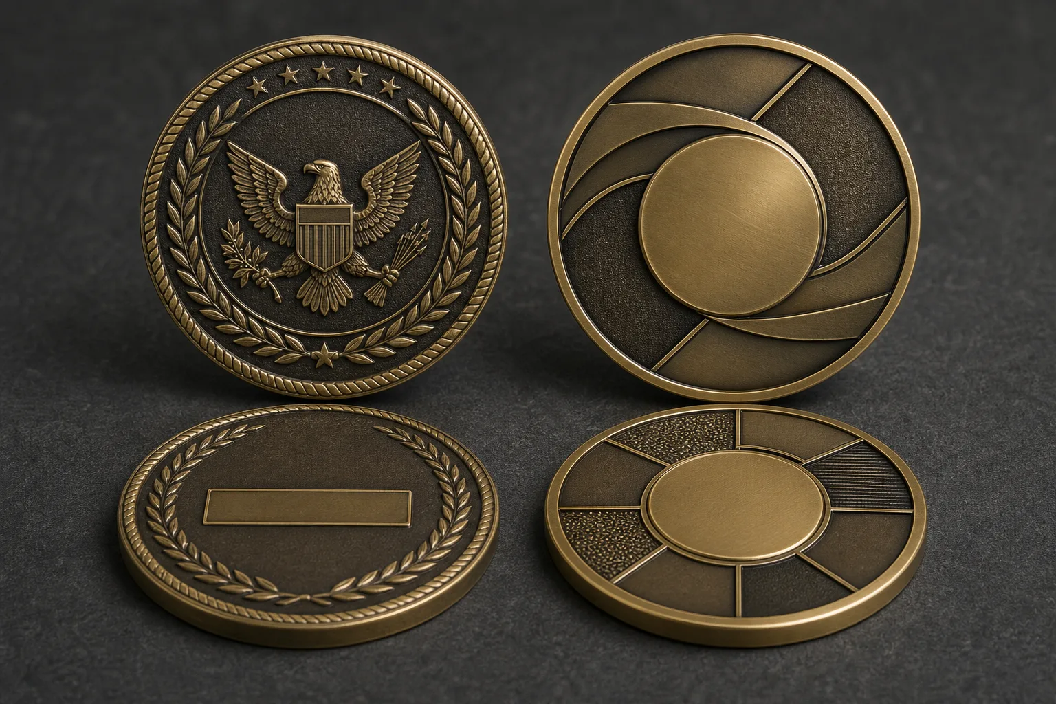
Validate the Actual-Size Proof and Complete the Challenge Coin Design Brief
Before tooling, run a five-second recognition check on each face. Can a buyer identify the dominant symbol and main message without reading every small detail? If not, move or remove lower-priority content.
- Print or display each face at the intended finished dimensions.
- Check spelling, dates, ranks, unit information, brand marks, and serial-number format.
- Measure lettering, narrow strokes, counters, and clearances in the scaled file.
- Flag compressed words, weak separators, and border text approaching relief or edge treatments.
- Verify front-to-back direction, top orientation, face alignment, border continuity, edge continuity, and numbering position.
- Check that perimeter details are deburred and do not create sharp contact points.
- Separate artwork approval from confirmation of dimensions, construction, finish, packaging, testing, commercial terms, and shipment requirements.
Accepted production artwork becomes the controlled reference for tooling and sampling decisions. It does not approve every other project term. Gairun’s pre-tooling engineering review may cover dimensions, thickness, relief, metal borders, color areas, component positions, and production method, with scope determined by the actual design.
- Scenario and intended audience
- Quantity and number of design variants
- Diameter or maximum dimension in millimeters
- Finished thickness in millimeters
- Front message and dominant subject
- Reverse message and variable-data area
- Border wording and edge treatment
- Relief direction: raised, recessed, layered, or sculpted
- Material preference, color treatment, and plating direction
- Numbering list, font, date format, and personalization rules
- Packaging, destination, and required schedule
Keep scenario ranges attached to their intended use. Official commemorative coins use 38–50 mm and 3–4 mm as contextual examples. Corporate anniversary coins use 40–50 mm and 3–4 mm. Complex 3D, unusual, multi-layer, or active structures use 45–60 mm, with 4–6 mm base thickness or 5–9 mm assembled thickness. Event giveaway coins use 35–42 mm and 2.5–3.2 mm. These are planning guidance, not final specifications.
Complex structures require extra attention to total thickness, component clearances, activity or magnetic-part specifications, and protective packaging. Small magnetic or moving parts can present a detachment risk and are not suitable for young children. Such designs need assembly tolerance, anti-loosening, drop, and transport testing before approval.
For an OEM order, provide the buyer-supplied design or specification with dimensions and construction requirements. For an ODM discussion, a sketch or broad idea can begin development, but feasibility still depends on the engineering assessment. A vector file, usable PDF, or hand-drawn concept can start an artwork discussion when accompanied by wording, colors, dimensions, and front-to-back instructions. No file is automatically production-ready.
Packaging should protect raised high points and finished surfaces. Depending on the program, options may include an individual protective bag, pouch, transparent coin case, display option, or gift box. A case or box should avoid rubbing the coin face or pressing high points, so final coin and packaging dimensions must be coordinated.
Frequently Asked Questions
What should go on the front and back of a challenge coin?
Use the front for immediate identity: one emblem, brand mark, anniversary theme, or recognition symbol. Use the reverse for context, such as a service message, milestone, date, values, location, recipient field, or numbering.
Is there a minimum coin lettering size that works for every challenge coin?
No universal minimum applies to every typeface, diameter, relief, finish, or forming route. Measure finished letter height, narrowest stroke, counters, spacing, and relief clearance at actual size, then confirm the result through supplier artwork assessment or sampling.
How can I fit a long organization name into challenge coin border text?
Use an approved abbreviation, move the full name to the reverse, shorten lower-priority copy, or place it on packaging. For circular text, calculate the usable arc and fit the actual typeface after deducting margins, separators, and clearances.
Should a motto, date, serial number, or QR code go on the coin or its packaging card?
A short motto or important date can fit on the coin when hierarchy and finished-size measurements support it. Serial numbers need a reserved flat field. A long URL or QR code is often better on a packaging card, unless physical testing supports the proposed metal-face version.
How do relief, enamel, plating, and matte textures affect a crowded challenge coin layout?
They can separate subjects, fields, and lettering, but they cannot create more layout space. Raised borders, controlled relief, enamel fields, matte areas, and plating contrasts work best when their boundaries are clearly marked and the dominant subject remains obvious.
What information should be included in a challenge coin design brief before proofing?
Include product scenario, quantity, dimensions, thickness, front and reverse wording, border and edge treatment, relief direction, material preference, color and plating, variable data, packaging, destination, and schedule. Attach artwork, authorization documents, numbering data, and orientation instructions when available.