
FACTORY-DIRECT OEM / ODM MANUFACTURING
Custom Metal Finish Guide for Clearer Design Decisions
Gairun is an OEM and ODM metal crafts manufacturer that supplies custom medals, challenge coins, lapel pins and badges, metal trophies and plaques, keychains and bottle openers. We work with event organizers, institutional procurement teams, corporate brands and promotional product wholesalers.
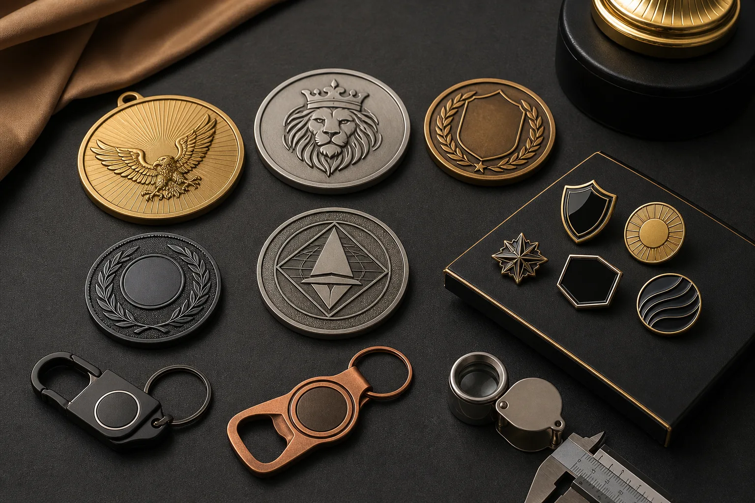
A metal finish controls the visible metal color, level of reflection, contrast and clarity of raised or recessed details. The right choice depends on the intended brand look, relief structure, colored regions and parts that need to stand apart. Gairun offers gold, silver, nickel, black nickel, antique bronze, antique silver, dual plating, sandblasting and matte surface effects. Use this custom metal finish guide to create a short list for artwork and quotation review.
Choose a Metal Finish by the Appearance You Need
Start with a visual goal rather than a finish name. A bright plated surface may suit formal recognition or a clean brand identity. Black nickel can frame light artwork with a darker metal tone. Antique finishes can give sculpted designs an aged or commemorative character. Dual plating separates selected parts with two metal colors, while sandblasted and matte areas reduce reflection.
| Visual goal | Finish options to consider | Main design question |
|---|---|---|
| Bright, reflective metal | Gold, silver or nickel plating | How much of the metal should compete with or support the colored artwork? |
| Dark metal contrast | Black nickel | Will dark logos or colors remain distinct from the metal? |
| Aged or commemorative character | Antique bronze or antique silver | How should raised and recessed areas read against each other? |
| Two-tone separation | Dual plating | Which regions or components use each metal tone? |
| Lower reflection | Sandblasting or matte finish | Which areas should remain quiet and which details should attract attention? |
Finish selection is separate from base-metal selection. If the forming material is still undecided, use the broader buyer resources to review that decision before finalizing the surface direction.
Compare Bright Gold, Silver and Nickel Plating
Gold, silver and nickel plating provide bright metal directions for logos, borders, lettering and open metal fields. They can support formal awards, clean corporate graphics and designs in which the exposed metal is a major part of the visual identity.
Gold plating
Gold plating creates a warm gold-colored appearance. It can reinforce ceremonial, anniversary or recognition themes, but it must be checked against nearby artwork. Warm-colored artwork may blend into the metal, while cooler or darker colors may create stronger separation.
Silver plating
Silver plating gives the design a bright, neutral metal direction. It can place more visual focus on colored regions because the surrounding metal does not add a warm color. Buyers should still consider reflection across large open fields and around small text.
Nickel plating
Nickel is another bright metal option with its own visible tone. It may be useful when the project calls for a clean metallic framework around logos, enamel areas or relief. The final choice between silver and nickel should be based on the intended visual reference rather than the finish name alone.
These finish names describe plating options, not precious-metal purity, plating thickness or a guaranteed shade. Final direction remains subject to artwork and product-structure review.

Use Black Nickel Without Losing Dark Artwork
Black nickel creates a dark metal framework that can make white, pale or bright artwork stand out. It may define outlines, raised lettering, borders and spaces between colored areas without using a conventional bright metal background.
The main risk is lost separation. A black logo, dark blue field or other deep color may merge visually with black nickel when the design is viewed at normal product size. Fine dark lines can also become harder to distinguish when surrounded by a similar metal tone.
- Identify all dark logos, text and colored regions.
- Check whether each dark element touches exposed black nickel.
- Decide which light or bright areas must provide the main contrast.
- Use a visual reference when a particular dark-metal direction matters.
Black nickel should not be treated as one universal black shade. Its role is to establish a dark metal direction, with the final appearance reviewed against the specific artwork.
Match Antique Bronze or Antique Silver to the Design Mood
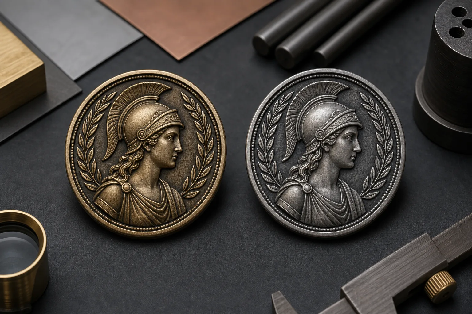
Antique finishes are useful when a design needs an aged, heritage-led or commemorative character. They often suit institutional emblems, milestone graphics and sculpted subjects where the buyer wants raised and recessed areas to read differently.
Antique bronze has a warmer bronze color direction. It can support traditional, historical or sculptural artwork. Antique silver has a cooler silver direction and may suit designs that need an aged effect without the warmth of bronze.
The choice is not only about color. Relief structure, open fields, recessed details and the size of the product all affect how the finish reads. An antique effect across a challenge coin may appear different from the same direction on a small badge or a larger plaque component.
Provide a reference image when a particular antique appearance matters. Finish names alone do not define an exact color standard, and the appearance must be reviewed for the individual design. No durability, wear pattern or aging method should be assumed from the visual term.
Plan Dual Plating Around Clear Design Boundaries
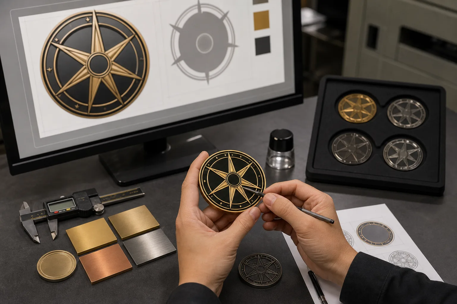
Dual plating uses two metal tones within one design or across coordinated components. It is most useful when one tone cannot create enough distinction between a border, emblem, central feature or assembled part.
For example, a challenge coin may use one metal direction for the outer field and another for a central emblem. A combination medal may assign different tones to connected components. A trophy or plaque may use a contrasting metal element to separate the brand mark from the main award structure.
The artwork must show where each plating color belongs. Boundaries should follow a visible design region, relief change or component split that can be reviewed before production. Labels such as ※gold outer border§ and ※black nickel center§ are clearer than a general request for a two-tone finish.
Dual plating is a verified Gairun capability, but suitability depends on the artwork and product construction. Detailed relief, mold and component decisions require technical review. Buyers who need production capability details can review our plating and metal finishes page.
Control Reflection with Sandblasted and Matte Areas
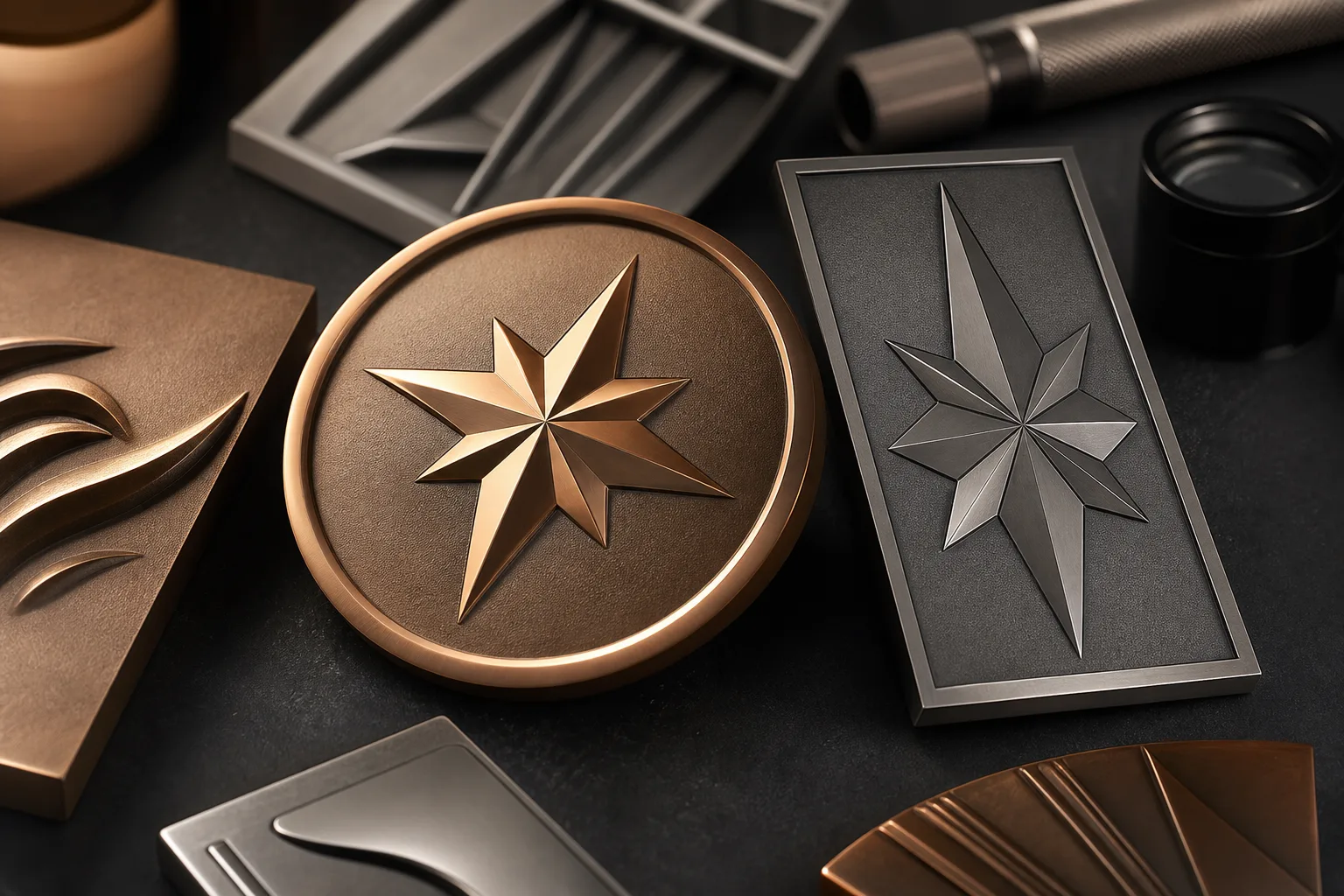
Sandblasting and matte finishes can reduce visual glare and create a quieter metal background. These effects are useful when a bright surface would draw attention away from a logo, raised subject, colored area or polished detail.
Placement is the key decision. A subdued background can make selected raised or brighter areas appear more prominent. Applying a low-reflection direction across every visible surface may produce a more restrained appearance, but it can also reduce contrast if no brighter or darker feature remains.
- Mark broad fields that should reflect less light.
- Identify raised, colored or brighter details that should remain visually dominant.
- Show whether the effect applies to the full face or selected regions.
- Review the placement on each side and component of the product.
Sandblasting and matte finish are verified surface options. Their use should be described by visual placement, not by unconfirmed texture grades, roughness values, gloss figures or performance claims.
Test the Finish Against Artwork and Product Structure
The same plating color can look different when the surface area, relief and adjacent colors change. A large open field reflects light differently from a narrow metal border. Deep sculpted areas create a different visual hierarchy from flat artwork. Small text also needs enough separation from its background to remain visible.
Review the following design conditions before choosing a finish:
These checks apply across Gairun’s custom metal product range. Medals and challenge coins often rely on relief and open metal fields. Pins and badges may use narrow metal borders around colored artwork. Trophies, plaques, keychains and bottle openers can combine larger surfaces, functional parts or separate components. Every recommendation remains subject to artwork and product-structure review.
Logos and small text
Check that the metal tone does not merge with important lines or letters.
Broad open fields
Decide whether reflection should be a main feature or a quiet background.
Recessed areas
Check how the finish direction affects the visual difference between low and raised surfaces.
3D relief
Consider which sculpted features must attract attention from common viewing angles.
Colored regions
Compare each color with the surrounding metal rather than reviewing it alone.
Multi-part structures
Define whether connected or moving parts use matching or contrasting finishes.
Prepare a Finish Brief for Technical and Quote Review
A concise finish brief allows the intended appearance to be reviewed without treating an early preference as final approval. Name one primary choice and, when possible, one acceptable alternative. This gives the engineering team a clear visual direction if the first option does not suit the artwork or product structure.
The finish brief supports appearance and feasibility review. It does not confirm production suitability until the artwork and structure have been assessed.
01
Product type and general structure
02
Preferred metal color
03
Areas intended to appear bright, sandblasted or matte
04
Antique bronze or antique silver direction, if required
05
Boundaries for each tone in a dual-plated design
06
Colored regions that must contrast with the metal
07
Reference images showing the intended appearance
08