
For most detailed medals and challenge coins, an antique finish is the stronger starting direction when the priority is clear relief. Darker tone in recessed areas can separate raised forms and make a sculpted hierarchy easier to see. A bright finish is usually better when the priority is polished reflection, broad exposed metal, and a clean contemporary appearance. This Metal Finish Selection Guide provides useful background, but the final result still depends on the artwork, base metal, relief, exposed areas, lighting, and approved finish reference.
The practical distinction is simple: antique treatment tends to emphasize tonal contrast, while bright treatment emphasizes reflected light. Neither finish creates physical depth. It only changes how existing geometry is perceived. A bright high point may catch light strongly, while an antique recess may appear darker and define the boundary around it.
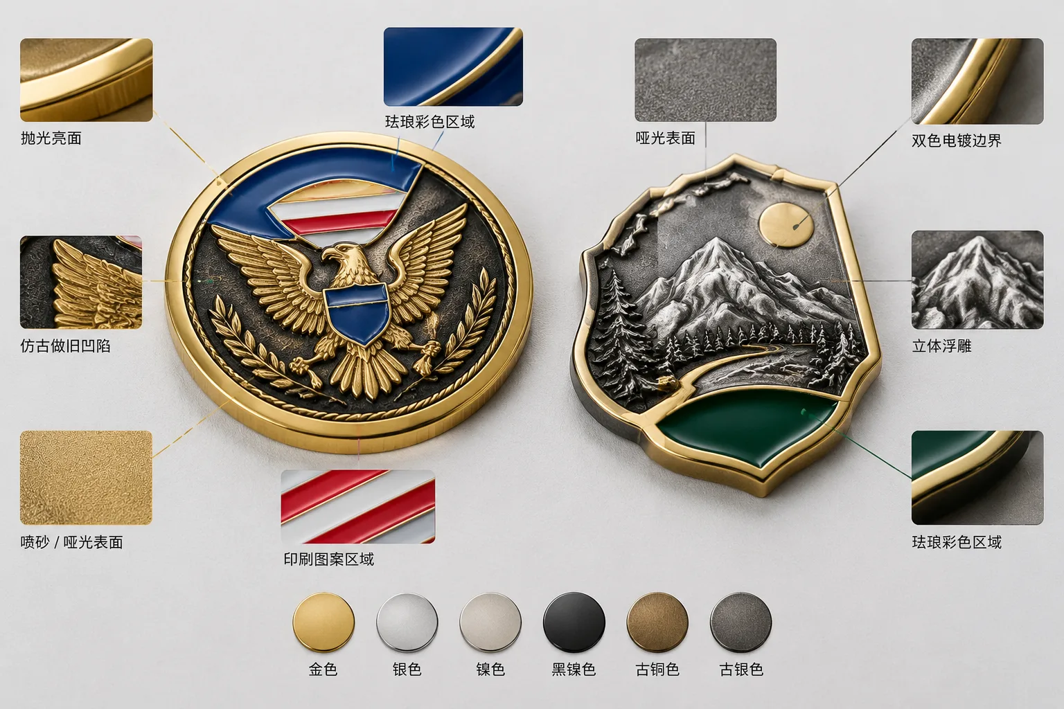
Gairun lists gold, silver, nickel, black nickel, antique bronze, and antique silver as plating directions. Final tone and feasibility must be coordinated with the artwork, base metal, relief, and exposed metal areas. Sandblasting and matte finishing may also reduce shine or create contrast, subject to the design and treated-area width.
Bright vs Antique Metal Finish: Which Shows Relief More Clearly?
When a buyer asks which finish shows relief more clearly, the answer usually depends on the type of relief. Antique metal finish is often the better initial choice for shallow, dense, recessed, or sculpted artwork. Its darker recesses can visually separate a subject from its background without relying entirely on viewing angle.
Bright metal finish is often the better initial choice for broad polished fields, simple raised forms, strong borders, and modern presentation. Reflection can make high points appear crisp, especially when the design has enough open metal for light to move across the surface.
Think of the choice as two different visual goals:
- Antique bronze or antique silver: stronger tonal separation between raised and recessed areas, with a subdued or heritage-oriented appearance.
- Bright gold, silver, nickel, or black nickel directions: more visible reflection on exposed metal and a cleaner, more contemporary presentation.
- Matte or sandblasted areas: controlled reduction of shine that can help separate a background from polished features.
- Dual plating: two plating appearances within one design, useful when selected areas need a deliberate visual separation.
These are finish directions, not guarantees of a particular gloss, color, plating thickness, precious-metal content, corrosion result, or durability level. A finish sample or written acceptance standard is the proper basis for approving a specific product.
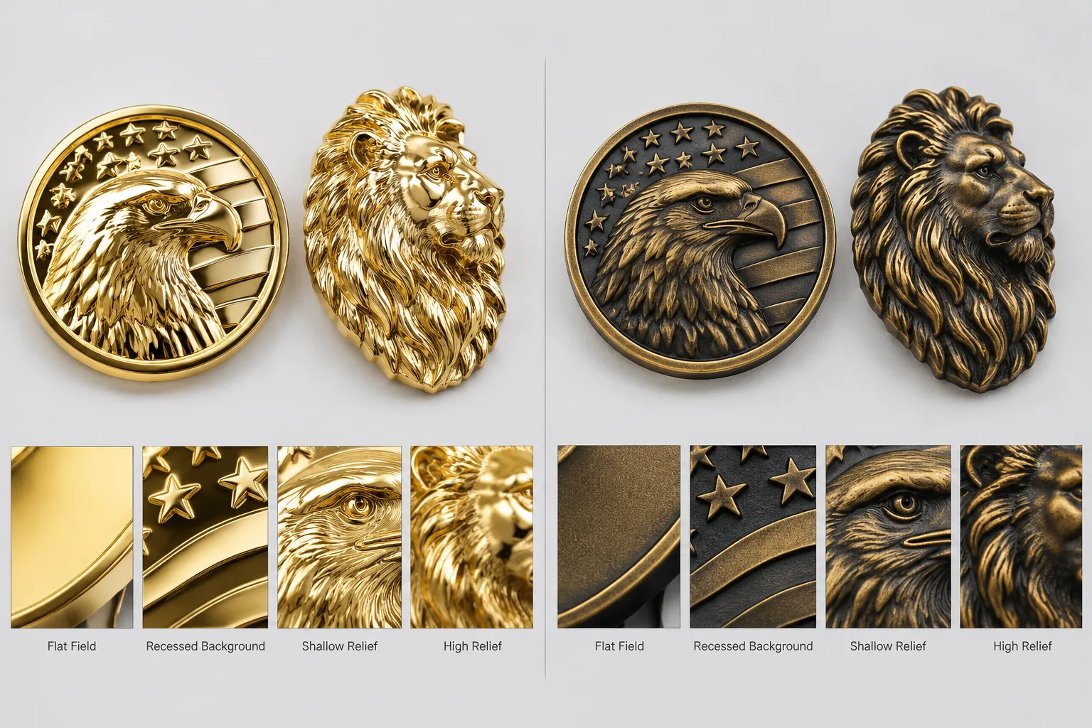
How Bright and Antique Surfaces Read on Flat, Recessed, and High Relief
A flat field provides little geometry for either finish to explain. On a bright surface, the field may look clean and reflective. On an antique surface, its darker tone may support a vintage appearance, but it cannot compensate for weak artwork separation.
Shallow relief is more dependent on contrast. Narrow raised borders or small recessed details may blend into a bright surface when lighting is diffuse. Antique treatment can make these boundaries easier to distinguish, particularly when the artwork contains many closely spaced forms.
Deep or sculpted relief creates stronger physical shadows. Bright treatment can make forward-facing planes stand out through reflection, while antique treatment can deepen the visual separation between front forms and lower fields. For a 3D relief medal, the artwork should identify which forms sit forward and which details remain recessed. Fine artwork may need simplification before it can reproduce effectively in sculpted levels.
For challenge coins, the primary subject can be separated from supporting fields through raised, recessed, layered, or sculpted forms. The artwork should identify the dominant feature and the intended relief hierarchy. A finish cannot correct inconsistent depth, overly narrow recesses, crowded lettering, or an unclear focal point.
Gairun lists zinc-alloy die-casting, stamping or die-struck forming, photo etching, and hydraulic high-relief forming. The suitable route depends on material, part shape, relief structure, and decoration plan. Forming and finish should therefore be considered together, rather than selected as independent menu items.
It is also important to separate physical relief depth from visual relief readability. A darker recess may look deeper, but the metal geometry has not changed. This distinction matters when comparing artwork proofs, samples, and production pieces under different lighting.
Finish Choices for Text, Texture, Enamel, and Two-Tone Details
Fine text often exposes the difference between antique plating and shiny plating. Raised text on a bright field may look sharp when the letters catch directional light. Recessed text may need more tonal separation, especially if the characters are small or surrounded by texture.
Wide borders are generally easier to read than narrow borders. A bright border can frame a coin or medal with a polished edge. An antique border can visually recede and leave the central subject dominant. Edge lettering, rope patterns, and fine teeth should be shown in the proof as part of the complete structure, not treated as separate decoration.
Matte or sandblasted areas can provide a controlled contrast against brighter exposed metal. Their suitability depends on the base metal, forming route, artwork, and width of the treated region. Do not specify only “shiny” or “matte.” State which surface is bright, which is matte, and whether the contrast applies to the background, border, raised subject, or edge.
Enamel and printed graphics should be assessed separately from bare metal. Imitation hard enamel creates a smoother face, bringing color and metal areas closer to one level. It should not be described as vitreous hard enamel or assigned unsupported durability claims. Screen printing is another option for defined graphic details when the design should remain printed instead of being divided into enamel cells.
Dual plating can separate selected areas visually, but the artwork needs clear boundaries. A bright subject with an antique field may work differently from an antique subject with a bright border. Feasibility depends on the relief and geometry, so the finish map should identify each area clearly.
A clear epoxy coating may be requested over a decorated surface. It changes the surface presentation and should be specified separately. It should not be described as scratch-proof, UV-proof, or chemically resistant without supporting evidence.
Two Artwork Examples: When the Initial Finish Recommendation Changes
The following are illustrative decision patterns, not Gairun customer projects. Each shows why the first finish recommendation can change after the artwork, construction, or sample is examined.
Example 1: Official commemorative challenge coin. The hypothetical design has a raised insignia, recessed background, edge lettering, and a formal presentation goal. An antique finish is the initial direction because the darker background can separate the emblem and help the relief hierarchy read from different angles. The recommendation could change to bright or dual plating if the buyer wants a cleaner reflective appearance, the relief is broad and simple, or selected polished areas must stand out. The variables are relief depth, exposed metal area, lighting, and the approved sample.
The coin brief should treat the front, reverse, border, thickness, edge, and orientation as one structure. Text direction, border continuity, face alignment, and edge orientation all require confirmation. Controlled emblems also require the buyer to provide appropriate authorization; reproduction rights should never be assumed.
Example 2: City or cultural commemorative coin. The hypothetical artwork shows an architectural landmark with layered relief, recessed windows, surrounding text, and local color. Antique treatment is the initial direction because depth and recess contrast are central to the design. The recommendation could change if the fine lettering becomes visually dense, the buyer wants a contemporary presentation, or a bright exposed border is needed. The variables are detail density, text size, border width, base metal, and sample appearance.
For cultural or architectural relief, the intended depth and finish should be confirmed together. Local coloring, double-sided artwork, edge text, and packaging can affect how the design is presented, but none should be allowed to obscure the main relief.
Example 3: Corporate anniversary coin. A bold logo, large year mark, flat color fields, and limited relief initially point toward a bright finish or bright-and-matte contrast. Bright exposed metal supports a clean brand presentation, while matte background areas can keep the logo visually controlled. The direction may change to antique if the approved artwork adds deeper sculpted forms or needs stronger separation between the logo and background. The variables are brand direction, relief hierarchy, color boundaries, and the buyer’s acceptance reference.
Bright vs Antique Finish Decision Table for Buyer Review
The table below gives an initial direction from observable artwork conditions. It is a starting point, not a final production specification. Finish, relief, base metal, decoration, and packaging should remain separate decisions.
| Observable artwork or product input | Practical visual implication | Initial finish direction | What still requires confirmation |
|---|---|---|---|
| Broad polished metal fields | Large areas can reflect light and create a clean, premium-looking surface | Bright | Base metal, desired tone, gloss expectation, and approved reference |
| Shallow raised relief | Small height differences may need tonal separation to remain legible | Antique or bright with matte contrast | Actual relief structure, viewing distance, and lighting |
| Deep sculpted relief | Forward planes and recesses create visible hierarchy through light and shadow | Antique for stronger recess contrast; bright for reflective high points | Forming route, fine-detail feasibility, and sample result |
| Dense recessed detail | Crowded lines can merge when contrast or spacing is insufficient | Antique | Line spacing, recess width, artwork simplification, and finish tone |
| Fine raised or recessed text | Letter edges may depend on reflection, shadow, and surrounding texture | Antique for recessed text; bright for broad raised text | Text size, font, border width, and orientation |
| Matte or sandblasted contrast areas | Reduced shine can separate background and polished features | Bright plus matte, or antique plus selected matte areas | Treated-area width, texture expectation, and sample |
| Enamel or printed graphics | Color surfaces may sit visually closer to one level than bare-metal relief | Either; choose from the metal surrounding the color | Color boundaries, metal borders, surface level, and coating |
| Dual-plating boundaries | Two metal appearances can direct attention to selected forms | Bright and antique combination where geometry supports it | Clear artwork boundaries and production feasibility |
| Formal presentation goal | Subdued contrast may support a traditional or commemorative character | Antique, subject to artwork | Institutional or brand direction and approved sample |
| Contemporary presentation goal | Reflective exposed metal can support a crisp modern appearance | Bright or bright-and-matte | Exposed area, lighting, logo treatment, and gloss expectation |
| Bright, antique, matte, or dual-plating areas in one design | Separate treatments can establish a visual hierarchy | Combined finish map | Area boundaries, relief geometry, base metal, and forming route |
Gairun’s pre-tooling engineering review may cover dimensions, thickness, relief, metal borders, color areas, attachments, component positions, and the proposed production method. The exact checklist depends on the product structure and artwork. Plated parts may be checked for color difference and plating adhesion, but acceptance criteria and test methods must be defined for the order.
What to Mark on the Proof, RFQ, and Sample Approval
Do not write only “bright finish” or “antique finish” on a quotation request. Mark the intended treatment on the front, reverse, border, edge, and selected relief areas. Identify the primary raised forms, recessed fields, matte zones, polished text, color areas, and printed details.
A practical RFQ should include:
- Product type, quantity, dimensions, thickness, and design variants.
- Front and reverse artwork, edge treatment, orientation, and relief hierarchy.
- Base-metal preference, plating direction, gloss or matte areas, and color treatment.
- Attachments, component positions, packaging, destination, and required schedule.
- Any unresolved technical choices that should be assessed before tooling.
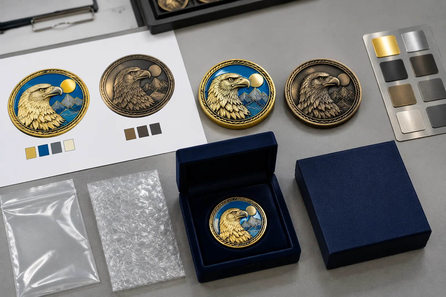
Gairun states that its design team can provide a free 2D or 3D artwork proof within 24 hours when sufficient project information is available. Current timing should be reconfirmed. The proof is a visual checkpoint, not a replacement for confirming dimensions, structure, finish, order terms, or production authorization.
When the relief-to-finish relationship is central to approval, a buyer-specific custom sample can show how the selected surface treatment interacts with the actual artwork. Sample approval and authorization for bulk production remain separate steps. Stock samples demonstrate general workmanship, finishes, construction, or packaging rather than the buyer’s custom design; availability and delivery cost must be confirmed separately.
Plating checks can include color difference and plating adhesion, but the project specification should define the applicable acceptance standard. Packaging also affects surface protection. Gairun lists anti-scratch packing, individual OPP bags, bubble protection, velvet boxes, paper display boxes, and plastic display boxes. Select among them according to surface exposure, presentation, distribution, and shipping needs. Packaging is not automatically included or suitable for every product.
Use the Buyer Resources when preparing the information package. For complex coins, compare the structure with High-Relief and Dual-Plated Coins, and confirm available directions through Plating and Metal Finishes. Material selection remains a separate decision; the Metal Materials Comparison can support that discussion.
FAQ
Does an antique metal finish always show relief more clearly than a bright finish?
No. Antique treatment often improves recess contrast, especially in detailed or sculpted designs. Bright treatment can show broad raised forms clearly through reflection. Relief geometry, lighting, exposed area, base metal, and the approved finish reference determine the result.
When is a bright metal finish better for a medal or challenge coin?
Bright is often a good starting direction for bold relief, broad exposed metal, clear borders, and a clean modern presentation. It is also useful when polished high points should catch light. The artwork should still be checked for sufficient depth and spacing.
Can a challenge coin combine bright and antique plating in one design?
It can be considered when the artwork clearly separates the intended areas. Dual plating uses two plating appearances within one design, but feasibility depends on the relief, geometry, boundaries, and forming route.
How should recessed areas, raised text, and borders be marked on the artwork proof?
Use a finish map. Label each area as bright, antique, matte, sandblasted, colored, or printed, and identify the physical level as raised, recessed, or flat. Show front, reverse, edge, and orientation together.
Should buyers approve a custom sample before selecting between bright and antique finishes?
When relief and finish interaction are central to the decision, a custom sample is useful. It shows the buyer-specific construction and appearance more directly than a stock sample. Approval of that sample should be recorded before bulk-production authorization.
Can matte or sandblasted areas improve contrast with a bright or antique finish?
Yes, a controlled matte or sandblasted area can reduce shine and separate adjacent surfaces. Suitability depends on the artwork, base metal, forming route, and treated-area width. Specify the desired area and confirm the appearance with a sample or acceptance reference.